#Copyrightstatus. Quality images havetobeuploadedto Commons by copyright holderundersuitablelicense. Fulllicenserequirementsareat [[COM:CT]]
#Statut du copyright. Les images de qualité doivent être téléchargées sur Commons par le détenteur du copyright, sous la licence appropriée. Les exigences en matière de licence se trouvent sur la page [[COM:CT]].
#Les images de qualité doivent être catégorisées. Elles doivent être titrées et décrites de manière significative. Leur descriptif doit comporter les noms scientifiques des minéraux et les taxons lorsqu'il s'agit de végétaux, d'animaux etc.
#Quality images must be categorized, have meaningful title and description. This should include the scientific names for minerals and Taxa naming for plants, animals etc.
#Pas de publicité ni de signatures dans l'image. Les informations concernant le copyright/la qualité d'auteur des images de qualité doivent figurer sur la page consacrée à l'image et/ou dans les métadonnées. Elles ne doivent pas interférer avec le contenu de l'image.
#No Advertisements or signatures in image. Copyright/authorship information of Quality images should be located on the Image page and/or in the image metadata, and should not interfere with image contents.
==Quality and Featured Photographic images==
==Quality and Featured Photographic images==
Revision as of 10:54, 11 February 2008
Template:Lang-QIGVersion en cours de traduction depuis l'anglais, votre aide est la bienvenue
Les images de qualité candidates doivent satisfaire à toutes les exigences suivantes et doivent avoir été créées par un utilisateur de Commons.
Les images remarquables candidates doivent remplir toutes les conditions suivantes et avoir un plus. Elles ne sont pas forcément des créations d'utilisateurs de Commons. Les images remarquables peuvent se permettre un défaut de qualité technique, si elles présentent une singularité suffisante et des circonstances atténuantes.
Normalement, deux versions d'une même image ne peuvent coexister en tant qu'Images Remarquables, car s'il y a une meilleure version, l'original est radié. L'objectif des Images Remarquables est de reconnaître les images les plus précieuses - un faible taux. Comme la qualité des images augmente, certaines d'entre elles peuvent être déclassées.
L'objectif du statut d'Image de Qualité est de constater qu'au moment de la création, le "Commoner" a habilement atteint un bon niveau de qualité. Cette reconnaissance n'est pas effacée par la suite, avec la progression du niveau.
Il n'y a pas de restriction du nombre d'Images de Qualité similaires, et il n'y a pas de procédure de suppression.
Une image "parle" différemment à chacun. Elle peut susciter des émotions telles que la tendresse, la colère, le désir, la joie, la tristesse. Un bonne photographie ne doit pas rechercher exclusivement à provoquer des sensations plaisantes.
S'agissant des Images remarquables, de nombreux votants pensent qu'un sujet extraordinaire peut combler et même passer avant la qualité technique. Beaucoup d'autres électeurs peuvent tout aussi légitimement estimer que chaque image doit être jugée uniquement sur ses propres mérites. Par exemple, une photo techniquement compromise d'un événement important recevra de nombreuses approbations en raison de l'importance de l'événement en question, et un nombre égal d'oppositions à cause de sa qualité technique.
Avant tout, soyez polis, restez courtois. L'image que vous jugez est d'abord le travail de quelqu'un. Bannissez les phrases telles que "cela ne ressemble à rien" ou "je la déteste". Si vous vous opposez, faites-le avec considération, et une bonne explication. Essayez de vous exprimer le plus possible en anglais, choisissez vos mots avec soin.
Joyeuses nominations, bon jugement, et n'oubliez pas... les règles peuvent changer.
Nous vous recommandons de calibrer votre écran avant d'examiner les travaux soumis. A défaut, il se peut que vous ne voyiez pas certains détails très clairs ou foncés. De nombreux écrans TFT présentent une teinte rouge lorsqu'ils ne sont pas calibrés.
Regardez l'image ci-dessous en plein écran, sur un fond noir (version avec un grand fond). Vous devez voir au moins trois des quatres cercles figurant sur cette image. Si vous voyez les quatre, votre luminosité est trop élevée, si vous en voyez trois c'est parfait, si vous en voyez moins de trois, votre luminosité est trop faible.
Exigences concernant la page de l'image
Statut du copyright. Les images de qualité doivent être téléchargées sur Commons par le détenteur du copyright, sous la licence appropriée. Les exigences en matière de licence se trouvent sur la page COM:CT.
Les images de qualité doivent être catégorisées. Elles doivent être titrées et décrites de manière significative. Leur descriptif doit comporter les noms scientifiques des minéraux et les taxons lorsqu'il s'agit de végétaux, d'animaux etc.
Pas de publicité ni de signatures dans l'image. Les informations concernant le copyright/la qualité d'auteur des images de qualité doivent figurer sur la page consacrée à l'image et/ou dans les métadonnées. Elles ne doivent pas interférer avec le contenu de l'image.
Quality and Featured Photographic images
Image size
common problems: Low resolution.
guideline: Images should have at least 2 real megapixels of information, for example, 1600x1250. For 'easy to take' images, reviewers may choose to demand more if the image would benefit from it.
reason:Graphics located on Commons may be used in ways other than viewing on a conventional computer screen. They may be also used for printing or for viewing on very high resolution monitors. We can't predict what devices may be used in the future, so it is important that nominated pictures have as high a resolution as possible.
JPEG compression
common problems: Too compressed, low JPEG quality settings in camera or when saving. Visible jpeg artifacts.
solution: Use better quality settings. For example set JPEG quality "superfine" in camera, or shoot in RAW, or save with 95% quality in image editing programs. If editing a JPEG multiple times, perform all edits starting with the original, or use a lossless format (such as XCF). Repeatedly editing and saving a JPEG image will gradually lose quality. And do not save edited JPEGS with a significantly higher quality than the original - doing so increases an image's size but not its quality.
Noise
common problems: Too much noise, be it chroma noise, luminance noise, visible grain, scratches in scan...
guideline: Images should not have distracting amount of noise when viewed in 100%.
advice: To reduce noise, use the lowest practical sensitivity or film speed(for example: 200 ISO film is less grainy than 1600 ISO!). If the photo was taken in unique circumstances and cannot be repeated, the image can sometimes be improved by filtering. Quality noise reduction software is expensive and algorithms computationally intensive - if you don't have access to suitable programs and equipment, ask at the Commons:Quality images helpdesk.
scan with dust and dirt
Exposure
common problems: Overexposure. Blown out highlights. Underexposure. Lost details in shadow areas, replaced by jpeg maps.
guideline: In correctly exposed images, details in a significant part of image are retained. It should be noted that exposure may serve a creative purpose, and this guideline should be evaluated with understanding of the idea or intent of the image. Exposure refers to the shutter diaphragm combination that renders an image with a tonal curve that ideally is able to represent in acceptable detail shadows and highlights within the image. This is called latitude. Images can be on the low side of the tonal curve (low range), the middle (middle range) or high side (upper range). Digital cameras (or images) have a narrower latitude than film. Lack of shadow detail is not necessarily a negative characteristic. In fact, it can be part of the desired effect. Burned highlights in large areas are a distracting element.
advice: When shooting with a digital camera, inspect the histogram.
Overexposed sky with jpeg artifacts.
Color
common problems: White balance off. Distracting (typically purple) hazing at contrast edges, visible in full resolution (chromatic aberration).
guideline: Quality images must have reasonable colors. Note that this does not necessarily mean natural colors.
solution: Color balance can be often corrected in software such as Gimp. If you don't have access to suitable programs and equipment, ask at the Commons:Quality images helpdesk and someone may be able to process the image.
examples:
bad white balance
Focus and Depth of Field
common problems: Improper or undefined focus, insufficient depth of field.
guideline: Every important object on the picture should be sharp. The overall image should have clearly defined focus, for example, the main subject is in focus and the foreground and background are out of focus, or else, the whole scene is in focus. This guideline should be also evaluated with understanding of the idea of the images. Depth of field is often low intentionally. If in doubt, ask. 'Depth of field' (DOF) refers to the area in focus in front of and beyond main subject. Depth of field is chosen according to the specific needs of every picture. Large or small DOF can add to or detract from the quality of the image. Low depth of field can be used to bring attention to the main subject, separating it from the general environment. High depth of field can be used to emphasize space. Short focal length lenses (wide angles) yield large DOF, and vice-versa, long focal lenses (telephotos) have shallow DOF. Small apertures yield large DOF and conversely, large apertures yield shallow DOF.
examples:
bad problem with focus
correct focus and depth of field
shallow depth of field serving a purpose
Motion Blur
common problems: Images blurred just because of shaking hand or subject moving too fast.
guideline: Motion blur in quality images has to have purpose, for example to emphasize motion. 'Movement control' refers to the manner in which motion is represented in the image. Motion can be frozen or blurred. Neither one is better over the other. It is the intention of representation. Movement is relative within the objects of the image. For example, photographing a race car that appears frozen in relation to the background does not give us a sense of speed or motion, so technique dictates to represent the car in a frozen manner but with a blurred background, thus creating the sense of motion, this is called "panning". On the other hand, representing a basketball player in a high jump frozen in relation to everything else, due to the “unnatural” nature of the pose would be a good photograph.
Lighting
common problems: Distracting reflections (usual problem with built-in flash). Unintended vignetting. Distracting harsh shadows. Lens flares.
guideline: Contrary to general belief, front lighting is not usually the best light as it flattens the subject. Side lighting often gives a better 'texture' to surfaces. The best light is often early morning or late afternoon, or on a slightly cloudy day.
Editing
common problems: Editing programs like Gimp have wonderful artistic filters and scripts. Unnecessary use of these, however, can be detrimental to the image.
guideline: Digital manipulation for the purpose of correcting flaws in a photographic image is generally acceptable, provided it is limited, well-done, and not intended to deceive. Typical acceptable manipulations include cropping, perspective correction, sharpening/blurring, colour/exposure correction, and removal of distracting background elements. More extensive manipulations must be clearly described in the image text, for example by means of the {{RetouchedPicture}} template. Unmentioned or misrepresented manipulations, or manipulations which cause the main subject to be misrepresented are never acceptable.
Composition
common problems: Unclear or non-existent subject.
guideline: The arrangement of the elements within the image should support depiction of the subject, not distract from it. The subject should not be cropped, unless it is only a specific part of the subject that is of interest. Foreground and background objects should not be distracting. You should check that something in front of the subject doesn't hide important elements and that something in background doesn't spoil the composition (for example that the streetlight doesn't "stand" on someone's head).The “Rule of Thirds” is a common guideline for composition that has been inherited from painting. The idea is to divide the image with two imaginary horizontal and two vertical lines, thus dividing the image into thirds horizontally and vertically. Centering the subject is often considered a negative practice. Subjects of interest are placed in one of the “interest points”, where horizontal and vertical lines intersect (4 interest points are created). Horizons are almost never placed in the middle, for they “cut” the image in half. They are placed either in the upper or lower horizontal line. The main idea here is NOT to center the subject without a very good reason.
Distortions
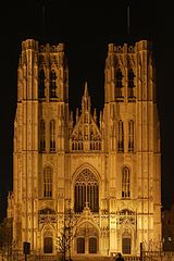
common problems: Tilt, perspective distortion and other distortions. An eye (or, more precisely, a brain) is a sensitive detector capable of spotting even a small tilt ... falling trees, towers and inclined water surfaces rarely improve landscape photography.
guideline: Images should not be unintentionally tilted. Images of architecture should usually be rectilinear. Perspective distortion either should have a purpose or be insignificant.
solution: Tilt can be easily corrected in almost any photo editing software. Various more complicated distortions can be adjusted in programs such as w:Hugin and w:Panorama Tools. If you don't have access to suitable programs or don't understand them, ask at the Commons:Quality images helpdesk and someone may be able to process the image.
bad perspective
perspective corrected with Gimp
Stitched images, panoramas
Height
guideline: Panoramic images need to have a minimum height of 800px.
Stitching
common problems: Stitching artifacts. Colors or luminance are not consistent across the image. Horizon line sinusoidal or even more complicated shape.
guideline: Getting a good panorama ready takes time. Recent releases of programs like hugin and enblend make simple errors like bad alignment and ghosts at blurred seam lines less common than they used to be, but parallax errors and more intricate quality problems still occur. Two examples:
The ingredient photos were taken with a camera not in panorama mode, and camera-bundled software was used for the top stitch. One notices that the left part is darker, due to the camera exposing each photo individually. This could be dealt with by adjusting brightness before stitching.
More subtle errors are at the right of the castle, where there appear to be two vertical bands in the sky. Look where these bands touch the hill, at the middle one the stitching program misaligned, producing a ghost. Also, the program feathers the transitions. While this avoids a visible edge, one can see that in such feathering region, image noise is reduced, which makes these parts stand out from the rest of the image.
The bottom image shows that using different software, the photos can be stitched without such errors.
Lighting
common problem: different exposure in different images, leading to overexposure or visible differences in brightness and posterisation
guideline: Even when photos are taken with the camera in panorama mode, unless one chooses an overall exposure for all images to handle the brightest part of the brightest image, then blown highlights are likely.
Ciemniak panorama.jpg
If possible, set for underexposure, as well as panorama mode. Expected advances in software based exposure correction may soon make panorama construction viable from a photo series not shot in panoramic mode. Until then, use the brightest part of your panoramic scene to set the in-camera exposure when shooting.
Some software provides blending algorithms that make the seamline invisible. But if the brightness of the original photos differs significantly, one still notices a transition in between photos. A few minor misalignments notwithstanding, this is what the top photo shows.
Some programs incorporate brightness adjustment for the photos, but the algorithm has to be designed carefully otherwise one can end up with posterisation effects like the purple and light blue patches in the clouds on the left in the bottom image.
Vignetting:
Blending-only programs can do away with seam lines and smooth structure using feathered overblending, but to correct lens vignetting one needs a radius-dependent brightness correction.
Deliberately strong vignetting
The left image shows a technically acceptable stitch, except for the vignetting effect which has been strongly exaggerated. Good stitching programs incorporate vignetting correction. Pre-processing the input images is less elegant, but one can obtain good results. In the sky can be seen three bright areas, separated by two darker bands. These correspond to the middles and the sides of the three original images. Although programs like enblend remove visible seam lines, they do not remove vignetting effects. In the sequence hugin-enblend it is at the hugin stage where vignetting has to be corrected, either inside a recent hugin version or as already corrected input.
On the right is a more subtle example of vignetting, most visible in the sky, where one can see three bright areas from left ot right separated by two darker bands. These correspond to the middle and the sides/corners of the three original images.
See in the photo below how the sky brightness spans the spectrum without being burnt out, but still the sky brightness has a wavy structure, most noticeable in the left part.
Tatra Mountains Panorama 01.jpg
Camera positioning
For the left stitch, the photographer captured the bottom part of the church, then stepped left and took a photo of the top part. The seam line is visible in the windows just below the clock, and one sees shifts in different directions in the middle and on the tower structures. Stitching software is not meant to cope with such parallax error as the problem here is located behind the camera, and the way out in this case was the availability of matching photos, albeit from a different perspective, to create the image on the right.
Image alignment
Proper alignment of images is a crucial first step and has been achieved in this view taken in the Western Scottish Highlands. But the exposure differs between images and cameras have vignetting, both make seamlines visible. And as these photo have been aligned regarding the distant features, some parallax errors can be seen at seamlines in the foreground. There exists software that makes such seams disappear and the parallax errors can be at concealed by choosing a suitable seamline.
Composition
common problems: Panoramas frequently lack a central focal point. If taken within urban settings, much of the scene may be uninteresting, and unattractive features such as rubbish bins and light poles almost impossible to avoid.

scan with dust and dirt


correct focus and depth of field