The printable version is no longer supported and may have rendering errors. Please update your browser bookmarks and please use the default browser print function instead.
This is an archive page for featured picture status removal debates. These debates are closed and should not be edited. For more information see Wikipedia:Featured picture candidates.
Delist Small, bad lighting, poor composition. It's a difficult subject to get a photo of, but even so, this image isn't good enough to be featured any longer. Makeemlighter (talk) 06:44, 26 December 2008 (UTC)[reply]
Keep: The image still has fairly good resolution, it's alot better than other pictures out there. Also I assume since no replacement has been found that this is as high as the resolution will get. Image size does not mean an image cannot be featured, that's saying that image size is far more important than EV, in my opinion, the EV of this is astounding.Jerry teps (talk) 23:10, 28 December 2008 (UTC)[reply]
Delist: This is embarrassing, originally I thought that the aerogel was the brick, then I realized it was the clear object below it, the picture poorly illustrates this and the only thing we have to go on is the caption. I fail to see how this problem got past the original nomination. Jerry teps (talk) 23:17, 28 December 2008 (UTC)[reply]
Keep It has a high EV and the relatively small size does not really hinder it. That is, unless we have a similar image of better size/quality ofcourse. Fransw (talk) 21:44, 6 January 2009 (UTC)[reply]
Nom'ed in 2006. Noted in the nom that it's a very abrupt animation, but I think comparing to today's animations, it just doesn't live up to the quality. This must be smoother to keep FP status.
British Columbia Parliament BuildingsEdit of the original. Suggest replacing current FP with this version.
Reason
The banding in the sky is an obvious detraction from this photo. I feel like it really takes from the quality of the image. It was discussed during the initial nom and an edit was created that reduced the banding. I think by today's standards it may not have been accepted, so I propose it here for delisting on those grounds.
I believe this is the same edit offered in the original nom? If so, it was noted that there were issues with the edit, to quote "...the current edit available has damage to the building as a result of the edit." I haven't compared them myself, but if this is correct, would you still support a 'replace'? And on another note, your signature takes up about 4 lines in the edit window - as impressive as I'm sure this is, is this really necessary? It makes it hard for other editors to follow things.--jjron (talk) 15:38, 8 March 2009 (UTC)[reply]
I personally don't see any harm having been done to the sky in the edit, which is why I suggest a replace rather than just delist. I did note the talk about the sky in the original nom, but I'm not convinced. Either way, users here can vote just to delist and not replace. But the edited image is of high quality too (very detailed) and I think deserves the continued status. ~ ωαdεstεr16♣TC♣15:49, 8 March 2009 (UTC)[reply]
I think you've misread my comment. The original nom talked about damage to the building in the edit, not the sky. Perhaps read through the original nom closely and see if you can see what they're talking about. --jjron (talk) 13:27, 9 March 2009 (UTC)[reply]
I'm no expert, but I didn't notice any glaring differences in the locations pointed out in the nom. Even so, the image is so detailed that you only would see these problems in full size, which is enormous. I think these would be minor issues that would be ignored due to the extensive detail already offered if it were up for nom now. ~ ωαdεstεr16♣TC♣17:15, 9 March 2009 (UTC)[reply]
Sorry, but that's unreasonable when the user's page references leaving WP due to direct threats to his/her family and the user's talk page is filled with goodbyes from other users. It's fair to assume the user is gone for good. But I did leave a message on the user's new name. ~ ωαdεstεr16♣TC♣14:28, 11 March 2009 (UTC)[reply]
Keep original Yes the sky is better, but look at the face on the gold statue(it is gone). Look at the edges of the dome(half gone). The two small domes beside the large one in the middle show posterization(one flat color where there should be texture). The edit to the sky damages the rest of the building. If someone can fix the sky without damaging the primary subject of the image I will support it. When I took this picture I accidentally used a polarized filter and shot from multiple angles, that is what lead to the band in the sky. I intend to eventually retake this picture. I support improving the sky but not at the cost to the building. While the existing image has flaws, it is also probably the most detailed picture of this building in the world. Chillum14:58, 11 March 2009 (UTC)[reply]
Note to closer While I can certainly accept my picture being delisted, I must strongly object to it being replaced with the alternative suggested. While people have voted for this replacement I don't think they were aware of the glaring faults with the repair of my image. Whole sections of building have been reduced to one or two flat colors, the edges of the building are half gone, and the golden statue has no face anymore. Please either close this as keep, or delist, but do not replace it with the inferior copy. Chillum01:15, 14 March 2009 (UTC)[reply]
File:Romanian hay.jpgBetter (original) version of the original Hay image
Reason
Nom'ed in 2005. Currently does not meet the size requirements. In addition, the quality is not really up to par; note the quality of the grass, especially in the foreground.
Weak keep. FWIW it does meet the current size guidelines (and I don't regard that as a good reason to delist regardless). Apart from that, no it's not stunning, is unfortunately a bit cutoff at top, I can't imagine it would pass on today's standards, but it's not terrible either and has certain charms which appeal. This is the type of thing I can live with as an older FP. --jjron (talk) 13:37, 9 March 2009 (UTC)[reply]
Keep pretty much per Jron, it's still an appealing, encyclopedic and pretty good image which outweighs the reasons given to delist. Cat-five - talk06:06, 10 March 2009 (UTC)[reply]
Keep. It's still a highly attractive photo that meets size requirements, even if it's towards the low end of quality now. That said, it's ripe for replacement with a new, better FP made with modern equipment (4 years is a long time in digital camera quality), but I don't see any reason to rush to remove it before then. Shoemaker's Holiday (talk) 19:31, 10 March 2009 (UTC)[reply]
Grand Tetons Barns The John Moulton Barn on Mormon Row at the base of the Tetons
Reason
I think it is time to delist this image; following is my reason:
It displays extensive JPEG artifacts
The snow is blown out
As this image can be retaken, the historical exception doesn't apply.
The license contains evidence that the author isn't fully aware of what "Public Domain" is; don't know if that is fully relevant, but could be investigated.
Delist. Borderline. It is a decent image, but the image quality is simply lacking by modern standards and detail is 'mushy'. By the way, which part of the license makes you think he isn't fully aware of what "public domain" is? I don't see anything wrong with it, but maybe I've missed something. Diliff | (Talk)(Contribs)17:06, 24 March 2009 (UTC)[reply]
Comment -- The inaccuracy is the ending sentence "This doesn't mean that you can take the material and then copyright it yourself. It's in the public domain and that's where I want it to stay", if I'm not mistaken, you can't make such statement when you have placed it in PD. Also, the license doesn't include provisions for events when public domain isn't a legal term in a country.→AzaToth17:29, 24 March 2009 (UTC)[reply]
Keep. Engaging image, perhaps wouldn't pass today on technicals, but that's not really a reason for a delist in my book. I may support a delist and replace if someone produces a better version, but until then I'm happy for this to stay. --jjron (talk) 12:20, 31 March 2009 (UTC)[reply]
I've never understood the dual standards for FP candidates and delist candidates... We should only have one standard: FP standard. It either meets it or it doesn't, IMO... If our standards change, then our list of FPs should adjust for that. Diliff | (Talk)(Contribs)10:52, 2 April 2009 (UTC)[reply]
Valid point, but who's keeping tabs on all 1500+ FPs to weed them out every time a 'standard' changes? I'm also not too convinced our standards are that standard - a couple of year's back blown highlights were all the rage and any image with even a single blown pixel would be poleaxed. Now images regularly pass with blown highlights (not badly blown, but you get my point), and there's still plenty of FPs around with blown highlights. It annoys me how a number of people will get on their high horses about minor technical grizzles or support solely because an image is 'mindblowingly big', but ignore important issues like lack of EV. To get to the point, I don't think the technicals on this image are that bad, and find the EV and interest factor ('wow' if you like) greater than a lot of what is cruising through atm. --jjron (talk) 07:34, 3 April 2009 (UTC)[reply]
I have to say, I never understood the fixation with blown highlights either. As long as they're not too distracting (an entirely white sky is a bit off-putting, but if the actual subject is properly exposed then no major issue IMO - obviously a blown sky in a landscape photo is completely different), I don't oppose them. But then, you said you were tempted to oppose the Frieze of Parnassus image for 'almost' blown highlights in one of the four images when it is usually very difficult to avoid in a 360 degree view. I certainly see your other points, but I don't think that the 'mindblowingly big' FPs are usually lacking in EV. EV is often increased by the detail available to the viewer, but EV can come from many things. Diliff | (Talk)(Contribs)07:48, 3 April 2009 (UTC)[reply]
Yet I have seen supports - especially when these monsters were just coming into vogue - when people's sole reason for support was the huge size of the image, with no evaluation of any other aspect proffered. That's my point, not that big images are lacking EV per se, which of course is not the case, but that just being big doesn't give an unencyclopaedic image EV. Re the Frieze of Parnassus image, I'd say the north image with the close to blown sky is offputting enough to be opposable if being evaluated in isolation - especially as the white of the sculpture tends to blend into the background particularly at right - however it is acceptable if included as part of a single image collage, as in that case the overall pros and cons of the full image can be balanced out. For so-called featured sets I believe each image needs to be fully evaluated in isolation, and if any of them fail then the set fails - as you said above, no dual standards. If this isn't done we risk seeing more abominations like this. --jjron (talk) 14:11, 3 April 2009 (UTC)[reply]
Keep pretty much per Jjron, these delists are starting to get tiring, I'm not saying that we shouldn't delist at all but these are getting ridiculous. Cat-five - talk01:09, 6 April 2009 (UTC)[reply]
Why do you find them ridiculous though? Jjron admitted that it likely wouldn't pass FP candidacy if nominated today. We're only trying to keep a healthy collection - bigger isn't necessarily better. Diliff | (Talk)(Contribs)10:26, 6 April 2009 (UTC)[reply]
Neutral "lowish res, nice pic"? The res conforms to standards. To quote from WP:WIAFP: "minimum of 1000 pixels in width or height". This one is 1000 pixels in width AND height. Besides, the camera is capable of more than that, so asking may be the way forward. "Nice pic" doesn't seem to actually argue for demoting. On the blown highlights side, how about we provide evidence of such claims as a matter of course from now on? Papa Lima Whiskey (talk) 21:19, 22 April 2009 (UTC)[reply]
For some reason there were a lot of strong supporters, and not one was an opposer. DOF is very shallow and narrow and not acceptable for a snail that size. The blown highlights behind the eyes distract. Some parts need sharpening while others are over sharpened. The shell seems half sharpened, half not as if edits were made to one side of the shell only (it looks like a stitching error). The edges seems too edited at full size. There are many more technical problems, but these should be acceptable for delisting.
Keep You said where there are shortfalls but the better option I think is to either fix it up or put in a request for someone else to fix it up, I forget the exact page for that though, and let it get fixed then do a delist and replace so the improved image is featured, not delisting it entirely. Cat-five - talk01:05, 6 April 2009 (UTC)[reply]
Delist I have always been unimpressed by this image. Between the blown background and the lack of detail on the snail itself, it simply is not our best work. Because there is no data in blown highlights, and not enough detail to "fix it up", this cannot be salvaged in photoshop. Calliopejen1 (talk) 01:21, 6 April 2009 (UTC)[reply]
I see. So less than an inch in length, and that afaik is the length of the "foot", not the shell. I'm not sure how convincing it would be to delist this on the basis of sharpness relative to size, not to mention that Cat-five has made a very reasonable suggestion. Papa Lima Whiskey (talk) 10:34, 14 April 2009 (UTC)[reply]
I would have made an exception, but the blown highlights don't convince me. Past FP candidates (similar in size) failed due to the fact of minor blown highlights. This one has too much and see this unfair. ZooFari22:25, 14 April 2009 (UTC)[reply]
That argument makes no sense in my opinion, we can't compare every FP to every other FP to determine per a subjective set of rules what fits and what doesn't if those rules change with each FP examined. If that were the case then we should just delist every n om because per your criteria nothing should be featured because it wouldn't be "fair" to the other pictures that maybe are more deserving but have their own minor flaws. Cat-five - talk09:21, 15 April 2009 (UTC)[reply]
I'm not saying this as obtaining fairness among my own opinion. Nothing is perfect in photography. And I mean nothing, even if it seems excellent. However, if this was being nominated above, would you support? The poor quality seems obvious to me, and doesn't fit our criteria anymore. It is not my decision, which is why I nominate here. ZooFari23:31, 15 April 2009 (UTC)[reply]
Keep or replace. If blown highlights were a strong criterion, this couldn't have been promoted, and this might have had some problems. Dig around long enough, and you'll find many more examples. Papa Lima Whiskey (talk) 01:22, 18 April 2009 (UTC)[reply]
Keep This is a compelling and high quality image which should have a home in Praying Mantis (have resotred it in the article. I've also added it to Insect mouthparts. Focus is spot on and composition is very good. DOF is as high as is possible with a live specimen, and I'd have thought you of all people, Muhammad, would be aware of the DOF limitations at 1:1 with the 150mm! You've used that (entirely valid) defence in several of your nominations --Fir000200:29, 22 April 2009 (UTC)[reply]
IMHO, it is possible to get a larger DOF for something of this size. Consider this 5cm long butterfly which has a larger DOF but was not promoted with the very same objection. Just yesterday, I pictured a smaller, 4cm long damsel fly in the wild with about the same DOF as this one. --Muhammad(talk)04:01, 22 April 2009 (UTC)[reply]
Keep Insect mouthparts is an appropriate, since it focuses on the head. The blur of the body and antennae is unfortunate, but it would be impossible to get the head with such detail otherwise.--HereToHelp(talk to me)00:59, 22 April 2009 (UTC)[reply]
Comment note that the image was removed because species ID was not shown in the caption. I have now added it in the mantis article. ZooFari19:46, 26 April 2009 (UTC)[reply]
The Golden Gate Bridge refracted in rain drops acting as lenses.The Golden Gate Bridge refracted in rain drops acting as lenses.
Reason
Many users and readers complained about the resolution of the image. I took another one that is of a higher resolution and better composition IMO. It has both North and South Towers of the Bridge shown. The quality is of course not so great, but I hope a litlle bit better than in original one.If somebody is willing to work on the original to make it look better, I'll upload one. Thanks.
Delist and replace New version is much higher quality and the lens effect stands out more because it's sharper. .froth. (talk) 04:09, 8 May 2009 (UTC)[reply]
Delist Logically, if the first one is not good enough on technical grounds, and the second one is not good enough on aesthetic or EV grounds, then the answer is to just delist. Stevage14:32, 17 May 2009 (UTC)[reply]
Keep The big droplet in the current FP gives it superior EV in my eyes. I don't think the quality is low enough to warrant delisting. Makeemlighter (talk) 21:28, 17 May 2009 (UTC)[reply]
Oppose (I guess?) I honestly prefer this one over the other; I would support delisting the other over this. I've always disliked the walkway in the foreground of the other. This includes the bridge, but not the railing and walkway, showing more of the river. Just my 2¢. I also prefer the lighting and the clouds. ~ ωαdεstεr16«talkstalk»05:03, 4 May 2009 (UTC)[reply]
Neutral: The sky and the whole picture really is spectacular in the twilight picture, but the night picture is more open. The bridge really takes up too much foreground in the twilight picture and really detracts from what's ostensibly the focus of the picture. Banaticus (talk) 05:09, 17 May 2009 (UTC)[reply]
Image was deleted on Commons because it was a copyright violation, see [1]. This is only a notification, I've already delisted it. Deleted MER-C08:31, 5 May 2009 (UTC)[reply]
OK, it was undeleted. Having a look at it, it is rather grainy and has an odd linearity to it (5/10 o'clock positions). Is this a keeper? MER-C07:32, 6 May 2009 (UTC)[reply]
Comment I think we need to be careful here: If images from the best X-ray telescopes currently in existence are all going to be judged inappropriate for Featured picture status, we may set an unfortunate trend of actively excluding certain important forms of information. That said, unless we have sources discussing information found in the X-ray image that is not in the replacement image, then this time, I'd support delist and replace. Shoemaker's Holiday (talk) 20:33, 10 May 2009 (UTC)[reply]
Can the proposed replacement be cropped from the bottom slightly? There seems to be some yellowing dust-type stuff that I'm not quite sure are stars and stuff in a line at the bottom. SpencerT♦Nominate!01:52, 26 May 2009 (UTC)[reply]
Keep I think the Chandra image is technically better, as in it provides better science and detail of the structure of the object. I also agree with Shoemaker's Holiday that this is an image from the best x-ray telescope in current existence. Not all images produced from these are going to be Hubble crisp, specifically when they're very distant, just as distant objects with Hubble look very grainy and bad as well. For scientific astronomic images we should be more forgiving of the technological limitations and rate it on scientific, encyclopedic and educational value more. So from that standpoint the Chandra image provides far more science and detail of the object. — raeky(talk | edits)14:11, 6 June 2009 (UTC)[reply]
Delist Woah, that is pretty rough. The stitching is also kind of obvious, especially with the error at the edge of the globe at about the WNW position. The sharp edge is also unrealistic and distracting. Is that a natural background or did NASA just replace with a single black? wadester1606:16, 1 June 2009 (UTC)[reply]
Keep per ev and technical difficulty. This is the highest resolution full view ever taken of Saturn's largest moon. When the National Geographic folks rocket over and take better pictures we can delist and replace. Note: I have a COI regarding this image, which I will disclose in full to anyone who asks via email. Perhaps that's what pushes this over the edge to break boycott, but am really surprised by recent delist noms which appear to entirely discount tremendous ev. DurovaCharge!17:09, 2 June 2009 (UTC)[reply]
VP is second string. FP is the stuff that belongs on Wikipedia's main page. Does the best photo ever taken of the solar system's second largest moon belong on the main page? Absolutely. We're an encyclopedia, not a photography studio. DurovaCharge!16:08, 4 June 2009 (UTC)[reply]
Picture of the dayY I'm not really a fan of images getting POTD more than once, especially considering how many FPs have yet to be honored with that. So it's already gotten that chance. It still has rough quality, even if taken from space. wadester1617:08, 4 June 2009 (UTC)[reply]
I'm sorry.... rough quality? You fancy popping to titan to take a picture in pitch black and insanely cold temperature? This image was produced with 1990's techknowledgy, it takes 8 years to reach Titan, and the next mission to this moon isnt even planned to lauch until after 2020 and wont reach the moon until possibly 2030. Please start learning about images outside the digital photographers perfect world of latest teckknowledgy and perfect conditions, get some clue and then possibly you might be able to provide a valuable critique on these images. Seddσntalk23:15, 5 June 2009 (UTC)[reply]
Yes, rough quality; did I stutter? Look at it. Do we not already have this entire section? As a citizen of mankind and a respected member of this community, I have the right to express my opinion. You, in turn, have the right to disagree, but I believe I've made it clear that I don't think this deserves to be an FP. I would ask that you deal with that. wadester1607:59, 6 June 2009 (UTC)[reply]
Regardless: the precedent this tends toward is dangerous. What do we do with the next rare NASA photo? Boot it down to VP so that yet another macro of a fly gets the main page attention? DurovaCharge!17:26, 4 June 2009 (UTC)[reply]
*Delist - Agree this would make a better VP than FP. Technical quality is low - stitching errors, pixelated edges, inconsistent sharpness, grainy, etc. The EV is extremely high though. Kaldari (talk) 21:08, 2 June 2009 (UTC)[reply]
Keep This image is not easily reproducable. There is a lack of images of titan, possibly one of the more important bodies in this solar system. And this is currently the best composite image of the whole surface. Please do some reading up on the FPC guidelines. They are there to read, understood and applied, not to be simply ignored. Seddσntalk01:17, 5 June 2009 (UTC)[reply]
I am not ignoring anything but it seems you may be. Quality is a requirement for FP and this one does not meet that criterion. --Muhammad(talk)12:46, 5 June 2009 (UTC)[reply]
Keep Unless someone is going to go out and take a better picture than this, then this picture is of tremendous encyclopedic value. Chillum14:59, 5 June 2009 (UTC)[reply]
In that case, we have tons of encyclopedic images with low technical qualities. Should we start featuring all of them? The images should meet all the criteria and this one clearly doesn't meet the quality one. --Muhammad(talk)18:19, 5 June 2009 (UTC)[reply]
I have no objection to other images of great encyclopedic value becoming featured pictures. If you look at my FPC record you will see I have supported many such images in the past. Chillum13:40, 6 June 2009 (UTC)[reply]
Are there higher quality versions of the surface of titan? No. Is there difficulty in taking better images of titan? Yes. Do the guidelines for FPC state that such images are allowed to become FP? yes they do. Are lower quality, rare images of highly encyclopedic content supposed to be Featured Pictures? They most certainly are. Point madeSeddσntalk23:04, 5 June 2009 (UTC)[reply]
Keep Best known image of the moon, until something better comes along this should stay. Astronomical images like this shouldn't be judged by the technology limitations that captured them. We have nothing better yet. — raeky(talk | edits)14:21, 6 June 2009 (UTC)[reply]
After second thought, the second pass image was heavyly edited from the original and I can't support that. Although it does look alot better, the editing makes it have less scientific value thus less EV. — raeky(talk | edits)
What makes you say it was "heavily edited"? Nothing about any of my edits affected the scientific value of the image. See my reply below for more information. Kaldari (talk) 20:33, 24 June 2009 (UTC)[reply]
Keep Easily meets the FPC. Note especially that criterion 1 states that "Exceptions to this rule [high technical standard] may be made for historical or otherwise unique images. If it is considered impossible to find a technically superior image of a given subject, lower quality may sometimes be allowed." While the image may be imperfect, it's impossible for there to be anything better. Nick-D (talk) 02:42, 7 June 2009 (UTC)[reply]
keep While the wow factor isn't great uniqueness and historical significance compensates for that.Geni03:39, 7 June 2009 (UTC)[reply]
keep I'm sorry, but this is one of the most technically impressive images in existence. The level of scientific and engineering work that went into this is simply mind-boggling. That it doesn't look great compared to images of nearby objects or such is in now way a reason to delist. JoshuaZ (talk) 17:30, 7 June 2009 (UTC) To clarify that there is now a "replacement image" I still favor keeping. That an image was the best that could be done at the time makes it still highly encyclopedic. The replacement image also appears to have less detail. I see nothing wrong with promoting the replacement to featured status as well. JoshuaZ (talk) 16:00, 15 June 2009 (UTC)[reply]
Delist and replace. I scoured NASA's databases and it turns out someone did create a better image. The currently featured image is a mosaic of 9 images taken by Cassini during its October 2004 flyby of Titan. A similar mosaic was created from 16 images taken during Cassini's February 2005 flyby. This later mosaic is higher resolution and doesn't suffer from all the glaring problems that the original has. In particular, the masking and stitching are much less noticeable (and it is much closer in shape to a circle, rather than an egg). The reason the bottom of Titan looks different in the newer image is that the cloud cover over the southern pole had dissipated during the months between the two flybys. Please compare both of these images at full resolution and you'll see a huge difference. (FYI, the replacement image does have some noticeable banding, but otherwise it's a much cleaner image.) Kaldari (talk) 21:02, 9 June 2009 (UTC)[reply]
Reaffirm keep, though the second image is quite solid and should be an FP in its own right. While the stiching is better for the second one, it also simply does not have as much detail of the planet's surface, which is also preferable. NW(Talk)04:33, 15 June 2009 (UTC)[reply]
The only difference in detail is that the cloud formation in the Southern hemisphere dissipated by the time the 2nd mosaic was taken. The amount of surface detail is pretty much identical. Kaldari (talk) 20:35, 24 June 2009 (UTC)[reply]
Reaffirm keeping original. I prefer to see the stitching/processing/photoshopping done by a professional at NASA because that person probably has a better CLUE how Titan really looks like than any one of us in who participated in this discussion and guessing whether it's noisy, lack of detail, or improper focus. OhanaUnitedTalk page06:06, 15 June 2009 (UTC)[reply]
Keep original as William M. Connolley says. The earlier photo has more obvious artefacts but has been nicely cleaned up, and the features are indeed a bit clearer despite its smaller size in pixels. Ohana : aren't they both processed/photoshopped by professionals at NASA? +sj+05:40, 16 June 2009 (UTC)[reply]
No. The 1st one is processed solely by NASA. The 2nd one is processed first by NASA, then "seams removed, distortion corrected, missing corner extrapolated" by User:Kaldari. I think if NASA has already touched up the photo, we should leave it as it is or else it could be over-manipulating. OhanaUnitedTalk page16:10, 16 June 2009 (UTC)[reply]
Where do you assume that User:Kaldari manipulated the photo? He states he got it from NASA's database and it's from the second flyby a year later which included more detail and more images. So where do you get that someone other than NASA has touched the second version? — raeky(talk | edits)15:10, 17 June 2009 (UTC)[reply]
My bad, it's in the image's description. The source image [2] does have some obvious problems, but is higher rez then the first pass. Maybe add the unaltered second pass image? — raeky(talk | edits)15:12, 17 June 2009 (UTC)[reply]
Keep original Regardless of NASA employees' photoshopping skills, I think this image should remain as is. Not every image needs to be cleaned up so it can look pretty, this is an encyclopedia not an art gallery. So what if there are stitching issues? This image is irreplaceable for the time being. --ErgoSum•talk•trib21:14, 18 June 2009 (UTC)[reply]
Delist and replace Hmmm, I was under the impression that the replacement was a photoshopped version by a WP user. Perhaps I was mistaken... after carefully reviewing the source image and the proposed replacement I think it is an acceptable improvement. --ErgoSum•talk•trib21:32, 18 June 2009 (UTC)[reply]
It was photoshoped by the uploader, the original is here, you can clearly see the problems he clone brushed out, which is the concern people express. In the image's description he notes he retouched the image. — raeky(talk | edits)00:37, 19 June 2009 (UTC)[reply]
I really should be more specific sometimes, I meant to say I thought the replacement was purely a photoshopped version of the original. I didn't read the entire discussion and thought that someone had drastically altered the photo. It looked like some of the detail (cloud cover) had been removed and that is what I based my original assessment upon. Thanks to wade I realized it was actually an updated photo from NASA that had been photoshopped and I suppose this is what the controversy is about. I support photoshopping as long as it is done correctly and with minimal harm, and that is the case here. Although I disagree with the uploader who "corrected" the shape to resemble a perfect sphere, when actually planets are oblate spheroids, and in reality should be distorted from a perfect circle somewhat. But in my opinion this is a minor issue and I am willing to overlook it. However I would understand if someone had an issue with this as it does not accurately reflect "reality", I just happen to disagree. --ErgoSum•talk•trib21:45, 19 June 2009 (UTC)[reply]
The edge on the bottom-right that's missing in the original NASA version is definitely not natural; it just means NASA didn't photograph those spots. wadester1621:55, 19 June 2009 (UTC)[reply]
Yes I realize that, but user Kaldari said, and I quote "In particular, the masking and stitching are much less noticeable (and it is much closer in shape to a circle, rather than an egg)", this is what I had an issue with. --ErgoSum•talk•trib22:10, 19 June 2009 (UTC)[reply]
Considering that the different mosaic versions of Titan from NASA all have dramatically different shapes, I don't think any of them accurately represent "reality". A body with the mass of Titan is going to be pretty much spherical (although obviously not perfectly). Regarding the corner that was extrapolated: It is actually based on later images that show that region, i.e. blurry gray clouds. None of my edits changed any factual information about Titan. In fact, in my opinion they created a more realistic image. For example, Titan in reality doesn't have a corner missing, nor does it have dramatic stitching lines across it's surface. I was very careful, however, to edit the image as conservatively as possible while still correcting these small problems. Kaldari (talk) 20:30, 24 June 2009 (UTC)[reply]
Keep original. I don't think editors should be retouching one off images such as this, the rule for photoshop should be to do no more than you could have done with more time shooting - this is clearly not the case here. Removing stitching changes the history of the image and alters what one might learn about NASA photography techniques. It also artificially increases the detail of the surface which seems dishonest. I would strongly oppose using the edited image. |→ Spaullyτ15:54, 22 June 2009 (GMT)
I think having a more accurate image of Titan is a bit more important than learning about NASA's "photography techniques". Removing the stitching merely involved adjusting the contrast where any two photographs intersected (along with a tiny bit of blurring). I really don't think there's any difference in the amount of detail. Besides, why would be want to preserve stitching artifacts? They certainly don't accurately represent the surface of Titan. Kaldari (talk) 20:42, 24 June 2009 (UTC)[reply]
With the stitching marks present we know those areas do not represent the true surface, when they are removed we are meant to presume that those areas are as true as the rest, making it dishonestly accurate - the image is no more accurate, as you suggest, but we no longer know the limits of our knowledge.
On the point of NASA photography techniques, this could be of interest to some as in this image - File:Eagle nebula pillars.jpg, albeit more dramatically for Hubble.
One final point, NASA are perfectly capable of taking out the stitching themselves if they saw fit so I wonder why we should second guess their decision not to. |→ Spaullyτ21:35, 24 June 2009 (GMT)
Kept Sorry, I know I voted in this, but it's been open far too long. This is an obvious keep (quick count gives me 16 K, 4 D+R). --wadester1616:12, 25 June 2009 (UTC)[reply]
True, they are sexually dimorphic, but both images are described as female. The description of the female in the House Sparrow article describes the female as lacking the black mark on the neck, which neither of the sparrows in the images above have, so I would say they are both female. Either way, as I said, I feel the image linked to in my previous comment is better than either of them and is also a female. It displaced the image up for delisting in the House Sparrow article on the 25th of May and has remained there since. Diliff | (Talk)(Contribs)13:07, 6 June 2009 (UTC)[reply]
Agree the quality is better in yours but I prefer the composition of Fir's. Anyway, that's another issue and we can probably open up another delist and replace nom for that. --Muhammad(talk)21:25, 8 June 2009 (UTC)[reply]
Neutral I must say that I don't like the lighting. Anyways, I don't want to support or oppose, but I do agree with Diliff that his sparrow makes a better female example in the taxobox. ZooFari02:52, 7 June 2009 (UTC)[reply]
Keep Still a fine image. I'm not sure why you'd be delisting Muhammad given this recent nom. Also it's well established that there's no limit to how many FP's there can be of one subject. This image has very dynamic lighting and good composition which sets it apart from others - it's a common bird so it's good to have a slightly artistic scene. Also on a side topic, IMO it's pretty poor form of you Diliff to remove an FP from its primary article without any discussion/consensus. Talkpage would have been a good start. I don't think the extra pixels on yours make up for the more distracting background and IMO less interesting pose... --Fir000212:48, 9 June 2009 (UTC)[reply]
If I thought that there might be contention over the replacement, I would have brought it to the talk page prior, but if I'm completely honest I didn't see a single aspect of your image that was superior. I don't find the background distracting (yes there is the bokeh of grass, but it doesn't bother me particularly). And then there's the image quality. The quality of either of your current FPs are clearly below current standards and I find it very difficult to believe that you would support them if they were nominated today and taken by somebody else. And you're right that there's no strict limit to how many FPs we can have of one subject, but in practise we usually want to see a different aspect in each one and not just a series of similar images. Where the images are too similar, it's generally been best practise to keep just one although I admit there have been exceptions - My own images of Tower Bridge for example. I'd be happy to delist one of them BTW, but I think in that case one had extreme detail, and the other had better aesthetics and so each provided something different to the viewer. Diliff | (Talk)(Contribs)13:16, 9 June 2009 (UTC)[reply]
I disagree about the "dynamic lighting and good composition which sets it apart from others" And if we can have more than 1 FP about a subject, then I prefer Diliff's over the one being delisted here. Muhammad(talk)18:23, 9 June 2009 (UTC)[reply]
Grainy, some artifacts, no longer in the mantis article (due to lack of identification), quality should be better for an adult mantis, which are quite a few inches long, only one article (which isn't relevant to a mantis) which decreased its EV.
Okay, as a Mantodea maintainer myself, I need to have the species ID (genus minimum) so I can include it in the mantis article. Maybe that will fill the EV needs for FP. ZooFari05:22, 8 June 2009 (UTC)[reply]
Keep. The composition and aesthetics of this image are exceptional. There's more to macro photography that DOF and resolution. Kaldari (talk) 16:20, 8 June 2009 (UTC)[reply]
How are they exceptional? I can't even see the details that make up the identification—- and it is all on composition. ZooFari21:16, 13 June 2009 (UTC)[reply]
What do you mean "make up the identification"? It is unidentified, but since it used to illustrate pollination, rather than the taxonomic group of the flower or insect, this is a bit less important. deBivort21:56, 13 June 2009 (UTC)[reply]
That's why it is unidentified. It does not display details enough to find the ID. And since there is no identification, there's no EV to support FP status. There are far more images showing pollination that includes the ID of the pollinator. Even if it was as you assert, this image is not the best illustration for pollination. ZooFari22:10, 13 June 2009 (UTC)[reply]
Photo of an ascending eruption cloud from Redoubt Volcano as viewed to the west from the Kenai Peninsula. The mushroom-shaped plume rose from avalanches of hot debris (pyroclastic flows) that cascaded down the north flank of the volcano.
Reason
In one hand - The image, both this and the previous one, present image noise, something that should be avoided for a picture to become a FP. In the other hand - This image cannot be reshoot, and is about a very rare and hard to capture (and risky) event, not mentioning that has high EV. I don´t know if this can be an exception to the featured picture criteria, so i´m posting here this nomination to get opinions and/or comments from the comunity of whether it must be delisted or not.
Neutral - I consider that featured images must not have noise, however, as i posted above, i also think (as posted in the previous nomination) that this image is very rare and cannot be retaken again (not for the same volcano). Therefore i´ll keep my vote undefined untill i get feedback from other users. - Damërung...ÏìíÏ..._Ξ_. -- 22:07, 5 July 2009 (UTC)[reply]
Keep: there is more to a featured picture than just the technical details of image quality; sometimes these debates lose sight of that. this is an amazing photo of an extraordinary event. we can't re-shoot it, & we can't plan on getting another simillar snapshot casually. if the tech exists to truly "sharpen" the image, not just airbrush & smooth over, then go for it. otherwise, until we get something legitimately comparable, that improves on the technical qualities, this should stay. Lx 121 (talk) 08:45, 7 July 2009 (UTC)[reply]
Involved keep as FPC nominator - Coming from a person who knows a lot about volcanoes, it is a picture that will probably not be taken again for years and years to come. ceranthor11:20, 8 July 2009 (UTC)[reply]
Weak delist While EV is a good thing, and eruptions of this magnitude are fairly rare, this is a pretty severe case of image noise. If it were a more notable eruption I could be swayed to "Keep", but this is certainly no Pinatubo. -RunningOnBrains(talk page)07:14, 13 July 2009 (UTC)[reply]
Weak Keep Still a fairly decent photo. The fake background doesn't bother me at all since it really has nothing to do with the pomegranate. As long as we have nothing better, I don't mind this staying featured. Makeemlighter (talk) 07:06, 28 August 2009 (UTC)[reply]
As far as I can see, there is no evidence that "usage granted by coffer curator from National Museum administration" is correct. Assuming good faith is nice, but if we're going to parade this as one of our finest pictures, it would be nice to have some proof that we're actually allowed to use it. We even have a deletion template for this- see Template:Di-no permission. Until we have proof of permission, this should be delisted, and perhaps even deleted. J Milburn (talk) 16:17, 12 July 2009 (UTC)[reply]
Comment I have to look into my archives for original permission, hopefully I still have it somewhere. Please be patient, as I have limited time due to RL issues. M.K. (talk) 08:31, 14 July 2009 (UTC)[reply]
Delist. If/When M.K. manages to confirm the permission, it should be easy to fast-track it back in to FP. No point in keeping it in the meantime. --Dante Alighieri | Talk20:46, 21 July 2009 (UTC)[reply]
It's been more than two months. Let's go ahead with the delisting. Per policy Wikipedia:AGF#Good_faith_and_copyright: When dealing with possible copyright violations, good faith means assuming that editors intend to comply with site policy and the law. That is different from assuming they have actually complied with either. Editors have a proactive obligation to document image uploads, etc. and material may be deleted if the documentation is incorrect or inadequate. Good faith corrective action includes informing editors of problems and helping them improve their practices. Durova331 21:07, 19 October 2009 (UTC) Withdrawing per Jake Wartenberg. Durova33306:26, 24 October 2009 (UTC)[reply]
A compositional mess, blurry, with far too much surrounding open space, dust cloud takes away from the image as well. Even after a clean-up, this is so far below par.
Keep. The nomination is a case in point about the haphazard nature of historic image delistings. While we have this (eminently replaceable with better material by the same photographer) and this (dismally low resolution), a high resolution file which is one of the very few color images that depicts WWII arms in operation during its working lifetime goes up on the block. Color photography was in its infancy during World War II, and was very expensive. Both the Library of Congress notes about this being a "transparency" and the border markings on the original strongly indicate that this was shot on Kodak sheet film, which was a superior process and more durable (in terms of discoloration over time) than the cheaper color processes which followed after the war. Alfred Palmer did a few others from the same series and LoC has subsequently provided higher resolution scans, so if someone else wants to restore an alternate would consider delisting and replacement. Durova35902:04, 8 November 2009 (UTC)[reply]
Keep per Durova. Tracked vehicles tend to raise dust when operated at any kind of speed, so this dust is characteristic of it (particularly operation in the North Africa Campaign). The dust does not obscure the body significantly, just the tracks. Mostlyharmless (talk) 02:46, 8 November 2009 (UTC)[reply]
Keep I remember finding this on LoC and being knocked out by it. As Durova says, its a very early and rare example of large-format colour photography that must have been incredibly difficult to work with in these circumstances. No need to go into any more detail, this is a completely misguided delist nom. Can it please be closed early? mikaultalk19:47, 8 November 2009 (UTC)[reply]
Keep. Grainy, but is not too bad. Has EV as characteristic landscape in Grímsvötn and Vatnajökull. Is a reference image (1972) which can be compared with present and future images, as the whole thing melts away. Elekhh (talk) 20:43, 26 November 2009 (UTC)[reply]
A before and after areal view of Passchendaele, a location of a WWI battle.
Reason
Durova mentioned that there were some WWI images that weren't up to snuff, so I looked, and found this. It really isn't feature worthy. High EV yes, but tiny, even by WWI standards, with quality issues. Especially if you consider that this is actually two images, this really should be delisted.
Previous nomination/s
If someone can find the original FPC nomination, please put it here.
Keep, I appreciate the sentiment here, I really do, but in my opinion, this should remain featured. It demonstrates an event that is entirely unreplaceable. Passchendaele as seen in the above picture is never going to be recreated, and the destruction in the below picture should hopefully never be reproduced. Aerial photography in 1917 was hugely limited, we didn't have NASA snapping wonderful photos yet I can forgive the quality on this front. I would hope a better scan could be found, but this is unlikely. Cowtowner (talk) 20:34, 22 November 2009 (UTC)[reply]
Aerial photography was more than half a century old by 1917. Examples from the 1860s are far better than this. See Mostlyharmless's comments below. Durova36916:33, 26 November 2009 (UTC)[reply]
Keep I echo the opinions of Cowtoner, essentially. However, I would be very open to someone visiting the imperial war museum and rescanning, however unlikely. SpencerT♦Nominate!23:17, 23 November 2009 (UTC)[reply]
Strong delist Encyclopdedic, but soft focus and very far below specs even if it were a single image rather than a composite. Also mismatched orientation, which would further detract from the dimension and filesize specs if corrected. We simply don't have a feature-worthy image of this subject. And the only reason this was ever promoted was because it was promoted when the FP program was very new (and availability/filesize was very different from current standards). Severely lacking in every criterion except EV. Durova36903:38, 25 November 2009 (UTC)[reply]
Retaining strong delist as expressed above: which would further detract from the dimension and filesize specs if corrected. Starting a talk page thread about this. Durova36918:54, 25 November 2009 (UTC)[reply]
Strong delist. My reasons have not changed: "There is no doubt that the events of Passchendaele were extremely important, and it would be wonderful to have a FP of the subject. This is a moving image, IMHO. However, the encyclopedic value of illustrating the destruction in this image is not particularly outstanding (it would be in the absence of other works), and the quality and size are well below what we accept, even taking into consideration the time and circumstances." Some things are important and interesting, but do not represent a high standard of visual illustration of that topic, even when the constraints on the producion of that image considered. They cannot be featured pictures. This is very clearly one of them. Mostlyharmless (talk) 02:45, 26 November 2009 (UTC)[reply]
Comment. This image is composed of two images that are approximately 250 by 335 pixels across. This is farfarfar below the standards of the field of aerial photography at the time. Compare with this image, taken in 1904. Aerial photography was 60 years old at in 1918. It was relatively well developed. What we have here is an ultra-low resolution web-copy of an actual photograph that is much much larger. It was simply an image found in 2004 when nobody had any idea about what a Featured Picture was. Voters now have no excuse for such ignorance. Mostlyharmless (talk) 11:10, 26 November 2009 (UTC)[reply]
Am doing an in-depth survey regarding the matter. Basically Silversmith's answer reflects a profound misunderstanding, and if that argument carries the day it may seriously hamper our site's growth and improvement in terms of access to premium quality digitized historic media and volunteers to restore it. Yes, that's a bold assertion. It comes from hard work and experience: two years ago when I began contributing to FPC this site had six featured pictures of World War I. I have contributed fourteen more about this war. In fact, the only FP promoted on this subject within the last two years that didn't have my name on the nomination was done by an editor I trained: I gave him the project and assisted him with parts of it. Without this work our FP coverage of this war would have stagnated at 2004 quality levels. The persistence of 2004 level material at the very top of the WWI gallery constitutes a significant barrier to progress, partly because Wikimedians have to be proactive and ask for access. The failing WWI tank candidacy is symptomatic of our failure to maintain minimum quality control: technical specs of incoming material from new sources that are only a little better than the worst of our showcase, and good faith labor gets wasted on attempts to restore third-rate source files. Durova36907:32, 27 November 2009 (UTC)[reply]
Well, maybe instead of just having a "delist" section to FPC, we should have a "needs better scan" section as well, because essentially you're saying that by just keeping these low-res images no-one is motivated to find better versions. As we can see from the Bison skull delist nomination, suddenly there is talk of obtaining a better version. My concern, which is why I said what I did about keeping this image, is that if it is delisted then we might just forget all about it. As long as it is there and in our faces as a low-res FP, perhaps someone is more likely to try getting a better version. If we had a page devoted to such images, people might suddenly decide their mission on here is to clear that page. And then we'd also have a talk page devoted to discussing attempts and giving suggestions etc. --SilversmithHewwo07:07, 28 November 2009 (UTC)[reply]
Silversmith, I think you have missed the entire point of Featured Pictures. It is not for "good enough" work. "Until we get something good to replace it" is an argument that would sink like a lead balloon with a nomination. It is to showcase the best. What we have done in the past is to very consistently delist images like this one. If someone does get a featurable quality version, they can renominate the image. Unfortunately, that seems to have changed recently. Mostlyharmless (talk) 08:38, 28 November 2009 (UTC)[reply]
I have voted to delist a few pictures recently, so I'm not just someone who wants to keep everything no matter what. I've also opposed recent nominations that I didn't think were great though others argued they had high historical value etc. I'm voting to keep this image because I like it just as it is. Yes, it would be better if we could obtain a better version, but I like this image more than a lot of current FP's that have exceptional quality which are as dull as dishwater. --SilversmithHewwo02:33, 29 November 2009 (UTC)[reply]
Keep. In my opinion, the EV for this image is so tremendous that it outweighs the size issue. For such a valuable image, I'm just content that the resolution is enough that it is possible make out what is depicted. As I said in the previous delist nomination, the actual image can be purchased for only ₤4.95. They offer an A5 300dpi JPEG via email. Surely that would meet the standard, no? NauticaShades11:26, 27 November 2009 (UTC)[reply]
Comment. So this is the only image ever recorded of damage in World War One? Because you are saying that this image has extreme encyclopedic value (and so are the rest of the keep voters on this page). I don't believe you for one second that there are not other images that convey the destruction very well, and have infinitely higher quality. Mostlyharmless (talk) 11:38, 27 November 2009 (UTC)[reply]
Like for example, most of the images in Second Battle of Passchendaele some of which could be featurable after restoration (I'm not suggesting Durova do it, she has more than enough on her plate). There is no comparison. They're all reasonable scans of original prints or from the National Archives of Canada. See Durova's comment above about the impact on Wikipedia of this and the other awful image that is likely to be kept for yet another reason why this should be delisted. I really want Wikipedia to have a Featured Picture of this battle (other than this, which should also be delisted, but won't be). What was then .16% of my country's male population were killed and .54% were casualties in a single day of fighting at the First Battle of Passchendaele. It has enormous significance to me. But Wikipedia deserves the best possible image as featured picture - and we can do that, if and only if there is a consensus to have high standards here. Mostlyharmless (talk) 11:58, 27 November 2009 (UTC)[reply]
As I said in the previous delist nomination, the actual image can be purchased for only ₤4.95. They offer an A5 300dpi JPEG via email. That is a very good suggestion if one wants to adopt a model where volunteers pay out of pocket for source material in an inappropriate format. In a year and a half nobody has made use of that opportunity, including its proposer. I have been striving to establish a baseline of 10MB in TIFF format for featured picture restorations. That baseline is making progress with museum negotiations only because the negotiators are showing them my personal galleries rather than the site's official featured picture galleries. This dilemma is very beneficial for me as an individual and I am likely to get another museum show in a European capital soon, but it isn't very good for Wikipedia. Other Wikipedians who edit historic media aren't getting as much attention as they deserve and a window of opportunity for meaningful development in this area may close. There are two schools of thought among volunteers who solicit institutional donations of historic media: quantity and quality. The Bundesarchiv donation of 100,000 medium images included no high resolution material, and WMF Deutschland is not prioritizing requests for better files. A vocal faction within the Israeli WMF volunteer comnmunity is ideologically opposed to the hosting of high resolution images and actively works to discourage its acquisition. Most of the en:wiki FPC reviewers are out of touch with these factors and deaf to attempts at communication, and as a result I may accept opportunities that lead in other directions. Durova36918:29, 27 November 2009 (UTC)[reply]
Some EV issues fixed, but I remain unconvinced with quality. The composition is poor in my opinion, the background photographers are underexposed, and the woman posturing is cut off. @ Elekhh: FP standards have changed since 2005 and it would be unfortunate if no one had guts to wear the cloths. ZooFari04:34, 28 November 2009 (UTC)[reply]
Regardless of how distracting is the "starlette", the image is not used to illustrate her as a movie star, but the film festival and the media exposure. I think is good for the composition that she's cut off, allowing thus the visual centre of the image to move towards the photographers. I agree that the image is not perfect in every single detail but I think it has high EV. I mentioned the very strong FP support from 2005 to underline that the image has such qualities. Elekhh (talk) 05:11, 28 November 2009 (UTC)[reply]
Comment. The basic concern is a serious cut off, but such images are hardly found in public domain. Also bear in mind this is ca. 1979. Brand[t] 07:14, 1 December 2009 (UTC)[reply]
Keep. I see no issues with the quality. The cutoff-posing starlet is a compositional decision by the photographer that I like; we see enough to get all the information, without sections that add little. Seems to fit well in the Cannes article at least - Peripitus(Talk)07:23, 13 December 2009 (UTC)[reply]
This is the better image available. This picture is of a bald eagle (Haliaeetus leucocephalus) on a bird show on the castle Augustusburg, Germany.Alt2: Different pose: featured on spanish Wiki.
Keep. On the balance I actually prefer the existing version. Quality of original and proposed replacement is similar, but I have a slight preference to the composition in the original. Quality of Alt2 is lower, especially noisy and possible artifacting in the background, and scattered white blotches all over the bird (I think they may be water droplets, but they're not really clear enough to tell for sure). --jjron (talk) 15:11, 18 December 2009 (UTC)[reply]
A copy of a nineteenth century Japanese print.Detail Loss of texture and tile-like effect is caused by repetitive use of healing brush at too large a pixel setting without resampling. Significant areas of this image have been damaged by hasty/ineffective attempt at restoration, while large numbers of dirt specks remain.Suggested replacement 37MB file restored from File:Great Wave off Kanagawa.jpg.
Delist, do not replace - The loss of certain inks means that the new one is problematic, though far better than the original one. This is a major mass-produced artwork, in a genre with a tradition of very precise restoration. We will eventually do better than both. Shoemaker's Holiday (talk) 05:59, 3 January 2009 (UTC)[reply]
Current FP Confederate dead behind the stone wall of Marye's Heights, Fredericksburg, Virginia, killed during the Battle of Fredericksburg Dec 13, 1862. Photographed by Capt. Andrew J. Russell.Edit 1 Restore as much as possible, correct fading towards lower left, crop away irreparable ares.
Reason
Not just low resolution (367KB), but ugly. Close call on the original promotion, arguably promoted due to uncertainty over the quality of other surviving material. Moving, but really not restorable.
Delist and replace in its current form, but i respectfully disagree that it beyond repair, so I am going to give it a go now I have thrown the gauntlet at myself :)....Mfield (talk) 18:39, 13 March 2009 (UTC)[reply]
Comment I have created Edit 1 here, still working on it but so you see where I am heading. Repair as much as possible, crop the irreparable bits, leaving the entire soldier lower left unlike the opposed edit in the original nom, correct fading.Mfield (talk) 01:48, 15 March 2009 (UTC)[reply]
The editing you've done already in Edit 1 is quite good. This photograph has great EV so thanks for salvaging it. -- AJ24 (talk) 17:42, 16 March 2009 (UTC)[reply]
Oppose Delist, I was the original nominator for the photo, and I restate, due to the rarity and scope of the photograph... and the sheer encyclopedic value it provides, it certainly deserves its place as an FA. Communist47 (talk) 23:08, 21 March 2009 (UTC)[reply]
What qualities do you consider essential? Higher resolution images in better condition of Civil War casualties are available, and of the Chancellorsville battle. DurovaCharge!00:40, 22 March 2009 (UTC)[reply]
Replace and delist note the changed order instead of saying delist and replace, this should not be delisted if it's not replaced pretty much per Communist47's argument that this is definitely falls under the historical image part of the guidelines. Cat-five - talk23:17, 21 March 2009 (UTC)[reply]
First flight of the Wright Flyer I, December 17, 1903, Orville piloting, Wilbur running at wingtip. Photo by John T. Daniels of the Kill Devil Hills Life Saving Station, using Orville's tripod-mounted camera.Proposed replacement.
Reason
Nominating as delist/replace. New higher resolution restoration.
Comment - This is a beautiful restoration. I have one comment though. To my eye, it looks a little bit on the dark side. Obviously the original is washed out and needs significant contrast enhancement. However, the Wright brothers in your version look almost entirely black. Compare against the original and the previous restoration. Obviously, it's a subjective opinion, but I'd like to see a slightly lighter version. Kaldari (talk) 15:08, 19 March 2009 (UTC)[reply]
Current FP (reuploaded by MER-C's request) - a horrible embarrassment.Suggested replacement - Three men, believed to be Commodore Matthew C. Perry (center), with Commander Anan and Captain Henry Adams, during their meeting with the Emperor of Japan. These meetings led to the Convention of Kanagawa which opened Japan to the West after centuries of isolation.Alternative 2 - Minimal restoration. This one has the correct colours, but beyond removing the masking tape (WHY?!?!), I've done nothing else.
Reason
An older version (which is rather humiliating in how badly I handled it - I wasn't yet comfortable working in colour, and so didn't do most of the restoration) passed FP. This new version replaces the old, and thus needs reconfirmation. This was heavily damaged, so no restoration could be perfect; However, this is also one of the only Japanese artworks depicting Commodore Perry's opening up of Japan. As I said on WT:FPC, I wanted to have this reconfirmed after the cleanup, and also, as this was an incredibly hard one, to catch anything I missed. I don't intend to clean up everything - it would look weird to have three heavily-degraded figures on perfect paper - but I can fix anything people find necessary, or any artefacts of the extensive cleanup.
I like the newly restored version, though I feel perhaps too much of the character of the paper has been removed - the gradient in the stain on the right-middle for example; also the midline crease has only been removed in places, why not be consistent? Though these are pretty minor points and if I had not seen the original I might not have noticed. Alternative 2 seems pretty washed out compared to the original. I still support delist and replace as it is an improvement. |→ Spaully₪† 10:11, 27 March 2009 (GMT)
I removed the midline where I thought it made the art a bit confusing (For instance, Perry's right (on our left) arm is already a bit hard to follow due to the damage creating all sorts of false sight lines) but didn't want to remove it completely. As for paper texture in the stain... basically, I could not get it to match colour while still having a convincing grain - You can do that pretty easily if you want to take the paper to white, but pristine white paper with the severe uncorrectable damage of this image? Not a good idea. After a long attempt to get the levels to work with the natural paper colour, in the end, I had to use paper from elsewhere to cover over the stain. It's one of the compromises that, unfortunately, sometimes happen in restoration.
There's certainly other options I could have taken, and another restorer might choose different options. Maybe in a few years, I'll come back to this and make new choices again. Shoemaker's Holiday (talk) 10:41, 27 March 2009 (UTC)[reply]
Conditional delist and replace Several dirt specks and scratches at eye level, on the background both left and right. Could use another pass to take care of that. Otherwise quite an improvement. DurovaCharge!07:23, 12 April 2009 (UTC)[reply]
Bombing of Nagasaki, Japan by the United States during World War IIProposed replacement Removed dust, dirt, scratches, and what looked to be hairs or threads
Reason
While this is unquestionably an irreplaceable image, it isn't unrestorable. This image is in pretty bad shape and I'm surprised it passed in 2007. I would suggest that this be delisted until it is restored, then renominated. It can definitely be renominated after some Photoshop TLC.
Strong delist and replace Wadester16 has been learning photoshop and had a go at this file to remove the easily-removable scratches, dust, and hairs. He would appreciate consideration of replacing the current FP rather than only delisting it. He will now stop referring to himself in the third person. wadester16 08:10, 5 June 2009 (UTC) Strong Delist — wadester1603:27, 1 June 2009 (UTC)[reply]
While I now see some effort, it is still not the quality we want and I don't think we will obtain it. High EV, but just an unfortunate misquality. I would say nominate at VP, but you people are just too peevy about it so I say delist, replace, and send it on its way. ZooFari20:50, 5 June 2009 (UTC)[reply]
Strong keep. Restoration is not a featured picture requirement; encyclopedic value is. This is one of the highest ev featured pictures at this website, and it's up for delisting over a handful of scratches? Nominator overestimates the feasibility of restoration. This is a photo of the bombing of Nagasaki shot through the window of a long range bomber. Window reflection is an inherent part of its encyclopedic value, and presents quite a challenge to restore--especially since it appears no high resolution uncompressed version of the photograph is actually available. First, do no harm; WP:SOFIXIT if you can. DurovaCharge!17:00, 2 June 2009 (UTC)[reply]
Hmm, yeah, good point. Sure, it is extremely encyclopedic, but what about quality? I'd see this photo better at VP for such conditions it is in. FP is not all about EV, unlike VP, so I will change to keep when I see some effort in it. ZooFari19:14, 2 June 2009 (UTC)[reply]
See above comments regarding the technical challenges of restoration and the unavailability of high resolution uncompressed versions. You are welcome to attempt a restoration also, if you wish, and to consult me for advisement during your work. This is one of the highest ev images at this website, and First, do no harm. (apropos of nothing, I reviwed this many months ago and decided restoration was not advisable under these circumstances. In all likelihood I would not support my own work over the current FP, but am willing to be persuaded by superlative work by an enthusiastic novice). DurovaCharge!21:19, 2 June 2009 (UTC)[reply]
It's not the window reflection (which I didn't even notice until you mentioned it) or the technicals that bother me; it's the effects of age: scratches, dust, marks, hairs, etc.—all reasonably fixable by a relatively skilled hand in photoshop. Remember, these FPs were nominated way before VPC existed, and passed mainly (in this case only) on their EV. Maybe its time we "demote" some of our lower-quality FPs and fill up VPC with them. I'd fix either of these if I could; but I have no experience nor time to learn how to restore at the level you do. We aren't doing harm; maybe this will be a saving grace for the VPC program. wadester1605:37, 3 June 2009 (UTC)[reply]
One of the challenges of restoration is to notice that sort of thing, and to anticipate in advance how those factors interact. Sure, there are few obvious scratches that would be easy to get at, but that approach dead-ends in an hour if one doesn't anticipate the hard parts. And the significance of the window view is lost unless one researches the background: the B-29 airplanes used on this mission were the most advanced long range bombers available, and the Nagasaki mission nearly ran out of fuel:
Kokura was the primary target, but when Bockscar arrived at its rendezvous point off the coast of Japan the third aircraft of its flight (the photo ship Big Stink) was not present. After fruitlessly waiting 40 minutes, Sweeney and Bock proceeded to Kokura but found it obscured by clouds. Sweeney had orders to drop the atomic bomb visually if possible, and after three unsuccessful passes over Kokura, conferred with weaponeer Commander Frederick Ashworth (USN). They agreed to strike the secondary target, Nagasaki.[7]
A combination of factors including confusion about a malfunctioning transfer pump made fuel consumption a critical factor. Ashworth did not want to be forced to dump the bomb into the sea and decided to make a radar bombing run if necessary.[8] However, enough of an opening appeared in the cloud cover to allow Bombardier Kermit Beahan to confirm Nagasaki and the bomb was dropped, with ground zero being about 3/4 mile from the planned aiming point.
In other words, the delays that were necessary in order to get a visual drop also meant the airmen barely managed to survive the mission without getting captured. Abandoning their original rendezvous point at Iwo Jima, they flew to Okinawa instead. And were almost out of fuel when they landed at the Okinawa airfield. Now if you'd like to try your hand at restoring this it might be a good exercise. And I'd help out. It could be a good exercise to see how much research and hard work really go into historic restoration. DurovaCharge!15:50, 4 June 2009 (UTC)[reply]
The history is extermely interesting, but it's not like the window reflection tells that story; it only shows two windows in the background and no other identifiable information. And you don't need that story or the reflection to know the image was taken from a plane. I believe the image would be better without the reflection, but it's tolerable given the rarity of the photo. That said, while restoration isn't a requirement, it's most certainly become an expectation. This image could easily sit happily at VP until somebody takes on the scratches and dust and can then be re-nom'ed at FPC. wadester1617:04, 4 June 2009 (UTC)[reply]
I wonder - and hope I'm wrong - that there are more personal issues that cause Durova to oppose. Firstly, I contacted her a month and a half ago about restoring this very image, considering how many otherphotographrestorations she has done. Her response was not "this image should not be restored" but rather the apathetic but accepting "Can't make any promises when I'd get around to it, but thanks for the pointer." So when wadster restores it, it becomes unaccpetable? Furthermore, Durova's argument is littered with red herrings. First the window reflection (which wadster left in place), than the history of the flight (which oddly omits how dust and hair got on to the film)...it does not make any sense to me why the extraneous elements, which (unlike the reflection) were added after the image was taken, should not be removed. Their removal is not art, it is to add to, not detract from, the EV. I'm hoping Durova hasn't been as underhanded as some of this evidence suggests to me, but her argument has been rather inconsistent, which is to say, nonexistent.--HereToHelp(talk to me)15:41, 15 June 2009 (UTC)[reply]
Keep or replace Do not really care one way or the other, but surely one of the images should be FP IMO.--Mbz1 (talk) 14:34, 3 June 2009 (UTC)[reply]
Do you see this as an FP or a VP? I believe the fact that the argument against it being delisted boils down to EV. But that's not all FPC is about; on the other hand, that's mainly what VPC is about. wadester1604:32, 4 June 2009 (UTC)[reply]
KeepProcedural strike of duplicate vote. PeterSymonds (talk) 00:41, 6 June 2009 (UTC)--GerardM (talk) 18:23, 4 June 2009 (UTC) Revisiting the past is in itself problematic. Revisiting them with just technical criteria is not that good an argument.[reply]
Keep If you can make a better version of this image fine. However until then this unique image of a historical event should remain featured. Chillum15:00, 5 June 2009 (UTC)[reply]
Regarding the proposed replacement, in several places tiny specks have been replaced with larger blurry spots. I think we should stick to the original until a less invasive touch up can be performed. Chillum04:45, 6 June 2009 (UTC)[reply]
Strong keep the notion of requiring the same quality of digital images for all pictures is threatening our ability to attract historic material. GerardM (talk) 00:14, 6 June 2009 (UTC)[reply]
So there's inherently something wrong with removing easily-removable scratches, dust, and hairs that have nothing to do with the original photo or the contents of the image? If it can be fixed, I believe it should be (again, not the content, the crap on top of the content). wadester1600:27, 6 June 2009 (UTC)[reply]
Strong Replace Yes, the window reflection is part of the EV, and I oppose removing it. But dust, scratches, hairs, etc. were added later and detract from the EV; they were not present on the plane.--HereToHelp(talk to me)16:20, 9 June 2009 (UTC)[reply]
"This is a photo of the bombing of Nagasaki shot through the window of a long range bomber. Window reflection is an inherent part of its encyclopedic value..." ~Durova; see also the next post.--HereToHelp(talk to me)15:03, 15 June 2009 (UTC)[reply]
Strong keep - per Durova (talk·contribs). Warning: the following is partly a rant. In my humble opinion, this nomination is ridiculous. Scratches, hairs, dust, etc. are one thing, although I'm not sure if a few here or there really matter... Taking out what was part of the original image is entirely different. Removing the window reflection did/would unacceptably alter this image. I don't care if things not present in the original are removed, but this anathema against something that was in the unaltered original scares me; how many other images have had content from the original edited out in an attempt to reach the sky FP's current technical needs? Anyway, 99% of historical photos, for obvious reasons, do not and cannot approach the quality of digital imagery; perhaps the criteria should be split, with one part addressing digital images and the other addressing non-digital images. Apologies to all if I have misinterpreted something in this. —Ed(Talk • Contribs)20:59, 11 June 2009 (UTC)[reply]
This delist and replace nom was regarding the easily-removed hairs and scratches. Nothing was said about the reflection until Durova brought it up. Note the differences between original and proposed replacement: only scratches, hairs, and dust are missing. The reflection (or original content of the image) isn't the point and never was. Maybe you should bring this up at WT:FPC, where it's more relevant. wadester1621:24, 11 June 2009 (UTC)[reply]
99% is quite exaggerating. The window reflection wasn't brought up by the nominator, and there is not assertion for it to be removed (if so, I'd like a diff). Don't see how Durova or Shoemaker's holiday's boycott fit into your description. ZooFari21:32, 11 June 2009 (UTC)[reply]
Hmm, apparently I did misinterpret something, except that I didn't imagine it would be this big. :-) I was under the impression that the window reflections were removed in the proposed replacement; it would have been easily fixed if I had just looked at the bloody image, but for whatever reason I did not. My apologies to wadester. 99% was meant as an exaggeration, as digital image does not automatically mean that it is high quality. My comment about Durova and SH was meant as an aside, I'll remove it as it really has nothing to do with what I said. —Ed(Talk • Contribs)03:50, 12 June 2009 (UTC)[reply]
Strong replace The restored version is superior, full stop. We don't need all those nasty dust and hairs ruining what would otherwise be an unequivocal featured picture. The restoration is not a compromise to the picture's encyclopedic value. Reguiieee (talk) 09:19, 12 June 2009 (UTC)[reply]
Not necessarily. I think the nominator shouldn't close it. My opinion was not the result, I only followed the consensus. ZooFari00:14, 17 June 2009 (UTC)[reply]
Reverted to original more consensus for keep than replace, proposed restoration incredibly sloppy, changing the shape of the clouds in dozens of places. This is simply not appropriate manipulation. Shoemaker's HolidayOver 206 FCs served18:05, 22 September 2009 (UTC)[reply]
Horseshoe Bend, Arizona in en:Glen Canyon National Recreation Area as seen from the lookout pointReplacement
Reason
Not used, universally replaced by the replacement version, which is higher in quality, but a bit bland (and possibly more accurate) colour wise. The water level difference is interesting.
Question Is it appropriate to nominate that as a replacement since it's not the same picture? I think all of the delist/replace noms I've seen have been for higher-quality versions of the same shot. Makeemlighter (talk) 02:53, 30 April 2009 (UTC)[reply]
Neutral whether the image stays or goes, I prefer that the image doesn't get replaced. Both images can stay and illustrate the water level differences. ZooFari04:01, 1 May 2009 (UTC)[reply]
Delist only but not replace, per ZooFari. There are also significant vegetation and lighting differences between the two images. --Karora10:26, 1 May 2009 (UTC)[reply]
Comment I believe the colours are accurate on both: Desert sunlight tends to tbe very bright, and thus washes out colours, but the first was taken during a cloudy day, the other during a sunny one. That's enough to make all or most of the difference seen. Shoemaker's Holiday (talk) 11:07, 5 May 2009 (UTC)[reply]
Keep. Although the replacement is technically better and has a much higher resolution, the composition of the first picture is better, IMO. The sky, colors, and cropping are all better in the original, and it doesn't have the distracting boat either. Kaldari (talk) 15:30, 27 May 2009 (UTC)[reply]
Keep. I like it. ;) For what it's worth, the color saturation as captured varies according to the time of day and the weather conditions, and saturation as viewed varies according to monitor calibration, etc. My shot is as I remember the colors when I was actually there, as viewed on my monitor. The replacement shot looks washed out on my monitor, though it might be closer to reality on other monitors. As to boats: there are actually boats in my photo as well; they're just docked. Boating is allowed on the river there, by permit and with tour groups. -- Moondigger (talk)
Delist and replace. The replacement is a technically superior version of the current featured picture. How can we not promote it when it made the final of Picture of the Year? I'll admit the current FP looks more pleasing as a thumbnail, but I see no other way unless we used that one in the articles and promoted the new image to FP.Reguiieee (talk) 16:01, 2 June 2009 (UTC)[reply]
Delist and replace The rock strata is much more clearly defined than the current FP. Larger, and although the thumbnail looks slightly bleached at full scale the colour appears natural. Seddσntalk04:28, 3 June 2009 (UTC)[reply]
Delist but do not replace. The proposed replacement should be nominated. It's too different from the current FP to be a replacement. Makeemlighter (talk) 06:19, 3 June 2009 (UTC)[reply]
Current FP. Oxeye daisyFile:Errors.jpg(1 and 2) Masking artifacts, (3) Over-sharpened, (4) Noisy backgroundReplacementOriginal (non-FP)
Reason
The current featured image has several technical problems, as illustrated at right. The replacement image is of similar resolution, includes the stem and leaf for additional EV, and doesn't have a distracting background.
Weak support for delist and replace. While the new image is better than the original in technical quality I prefer the background of the original - more natural, flowers don't often have burgundy backdrops. On balance I think the new image should replace the old. |→ Spaullyτ16:22, 22 June 2009 (GMT)
Now the original has turned up it satisfies both points - having a more natural background and without the problems of its' edit. Weak support for Replace with original, though it is somewhat soft in parts, presumably why someone tried to sharpen it. I agree a natural background is not absolutely necessary, but definitely preferred. |→ Spaullyτ07:54, 25 June 2009 (GMT)
I changed the background to black (which I admit is only slightly better than burgundy). For cultivated flowers, I don't think a natural background is always necessary, but generally I prefer them as well. Kaldari (talk) 14:20, 23 June 2009 (UTC)[reply]
Delist - An image with such technical problems should be removed from FP, and about the replacement, I´m not sure if I want to vote for replace it into FP, but it´s very good anyway. - Damërung...ÏìíÏ..._Ξ_. -- 06:47, 23 June 2009 (UTC)[reply]
Have located the original nom, but I don't think you've notified the creator of this delist nom as per requirements. --jjron (talk) 09:01, 24 June 2009 (UTC)[reply]
Thanks for finding that and reminding me to notify the creator. I didn't even remember that I was the person that nominated the original one! Kaldari (talk) 15:10, 24 June 2009 (UTC)[reply]
Replace with Original What is wrong using my original source image? (It is a FP on Commons and 2 other Wikipedias) The current FP is a modified version. The original does not suffer from the various masking problems and oversharpening, it has a more natural background, and has higher spatial resolution than the proposed replacement. I like mine because it actually shows the detail in the white petals, something that is not as evident in the alternate version (because of the slight overexposure). With problems #1, #2, and #3 eliminated, I don't see how the background noise (#4) matters relative to the flower itself, but that's just my opinion. -- RM23:48, 24 June 2009 (UTC)[reply]
Replace with Original per RM. Lighting swings it for me, sharpness is fine as it is, plus I think the setting is just plain nicer than black. FWIW I don't see overexposure on the other, just harsher lighting. --mikaultalk12:37, 25 June 2009 (UTC)[reply]
The whites and bright yellows are clustered at the high end of the histogram. They're not clipping, but you don't have quite as much detail (thus "slight"). -- RM23:52, 25 June 2009 (UTC)[reply]
From what I remember, the reason I pushed the curves petals on the FP edit was to make the flower look more like it would to the eye. On the original the petals appear somewhat grey, maybe due to the metering being fooled by the white petals but pure white petals should look white in an image. I didn't bring down the white point so there shouldn't be any more clipping than was present in the original, all i did was push the curve slightly. I am certainly embarassed about the masking mess, which I would have fixed if it had been noticed in the original nom. Mfield (Oi!) 16:42, 29 June 2009 (UTC)[reply]
Delist and don't replace all the versions and proposed replacements are below the bar for flower FPs now, certainly for such a common species and with focus stacking being more routine. A new nom should be sharper all over than all of them, have an appropriate background, and be better exposed than the original. Mfield (Oi!) 04:30, 28 June 2009 (UTC)[reply]
That may be your opinion and even be common practice, but it is not what the rules state. It is among "best examples of a given subject'" and is of "high technical standard". There may be many images of different species that are far superior, but requiring focus stacking on this one is not appropriate. If another one comes along that is superior, then by all means delist. -- RM20:19, 28 June 2009 (UTC)[reply]
Well naturally it is my opinion, this is a discussion after all. I never said that there is an expectation that macro images should be focus stacked, I certainly never said it was required, I meant that with focus stacking being more common and relatively easier now, expectations have been raised somewhat to what is possible. There is a valid expectation that images should have adequate DOF to fully cover the important parts of the subject, and the petals of a flower should be sharp if they can be fitted within DOF. If parts of the petals are out of focus then the image could have been shot at a smaller aperture, had the original been shot at f11 or higher instead of f8 then the petals could have been sharper as they are in the proposed replacement image, which unfortunately has a less appealing background. The rules are a guideline, we do have an established expectation that images of exceptionally common subjects should be held to a technically higher standard than trickier or rarer subjects. Mfield (Oi!) 16:42, 29 June 2009 (UTC)[reply]
This is wrong. 4 supports to Replace with Original, 2 straight delists. How is this a delist rather than a replace with original? --jjron (talk) 12:52, 13 July 2009 (UTC)[reply]
I've just finished a much better version with better colors, a better layout, more facts, and more frames. I think we can safely replace the current FP with this.
Keep original - The info text needs some padding on the left side. Right now it is flush against the border of the box which makes it hard to read in thumbnail size. Kaldari (talk) 18:28, 16 July 2009 (UTC)[reply]
Will fix. I was wondering, since this is somewhat different from the original, should I just nix this and put it through a standard FPC on its own merits? --Golbez (talk) 18:41, 16 July 2009 (UTC)[reply]
Conditional Delist and Replace or Delist + New Nom The new one is better, but it has a low contrast between each color, making it difficult to notice where each change happens. The pink color wasn't pretty, but at least, you saw right away where the yellowish territory becomes pink. Ksempac (talk) 16:21, 5 August 2009 (UTC)[reply]
Delist and Replace This is definitely better and I like the subtler colors. The difference between them seems enough for me at full size. wadester1605:35, 6 August 2009 (UTC)[reply]
Keep original I dislike the addition of Greenland and the United States which add nothing to understanding the evolution (most articles will have a map of Canada in context). I also prefer the original colors although they could be made better... but a little more contrast makes colors easier to see while animated. grenグレン21:28, 13 August 2009 (UTC)[reply]
Current PNG versionProposed replacement SVGAlternative replacement
Reason
Today, diagrams are typically requested to be in SVG format before discussion takes place. Since there's already an SVG, I propose replacement. I expect this to be mainly a procedural move.
Delist & replace the SVG should be brighter, the borders should be removed, a web-friendly font should be used, and coloration of leaves should all be equal. ZooFari06:50, 9 June 2009 (UTC)[reply]
comment no reason to insist on svg when high resolution png is available. In my opinion, svg is an inferior format that renders with inconsistent geometry, speed, and reliability across platforms. Also, a non serifed font for the small text would look better. deBivort20:36, 9 June 2009 (UTC)[reply]
Actually, there should be no problem rendering if the SVG is compressed correctly (and not worry about inconsistent geometry). Speed is not an issue, as the file size never changes when changing resolution. The only con is that a browser may not support it, or an extension may be required to open it. ZooFari05:09, 10 June 2009 (UTC)[reply]
In principle you are right, but every browser system that is remotely up to date renders high resolution pngs quickly and without the need for extensions. deBivort19:57, 10 June 2009 (UTC)[reply]
Debivort, I think the png vs svg debate was solved a long time ago. The svg version is nice enough that it could be a poster, that's obviously the one we want.-Ravedave (talk) 05:34, 16 June 2009 (UTC)[reply]
Comment - Would like to support replacement SVG, but unfortunately it doesn't use web-safe fonts. I also agree with ZooFari that the outside border should be removed. Kaldari (talk) 21:39, 11 June 2009 (UTC)[reply]
Unfortunately, it doesn't :-( Unlike the small captions, the titles were converted to from "text" to "path", which is required in order for Wikimedia to render it. Conversion to path is really unwise, as it makes a huge file size boost. ZooFari05:49, 16 June 2009 (UTC)[reply]
Comment - "Alternate", "Opposite", "Whorled" etc are leaf arrangements or phyllotaxy or phyllotaxis, not leaf shapes. Also mis-spellings should be checked and corrected - e.g. "flabellate" not "flabelate" Rotational (talk) 08:05, 27 June 2009 (UTC)[reply]
Make that Conditional Delist and Replace pending fix of the typo. I'm not as concerned with the other change Ksempac mentions, although it would be nice. Makeemlighter (talk) 01:32, 6 August 2009 (UTC)[reply]
Comment Before a delist and replace, some concerns should be adressed : the typo on flabellate, and the mix between shape and leaf arrangements. A new group should be added "Leaf arrangements" which would take all the arrangements out of the shape group. Ksempac (talk) 16:23, 5 August 2009 (UTC)[reply]
Maybe! I guess I figured since he made the original picture, he'd be the one to go to for an updated version. Feel free to contact the SVG's creator if you think he can make the desired changes. Makeemlighter (talk) 07:38, 22 August 2009 (UTC)[reply]
I don't really understand the non-NPOV comment re the captions - could you explain? I really think this would be considerably less informative without them, especially for a casual user. In terms of a delist and replace I'd probably suggest just fixing the typo and ensuring websafe fonts. Anything beyond that I think would require a different nomination. --jjron (talk) 02:21, 28 August 2009 (UTC)[reply]
Shamelessly stolen from here, "Resembling a hand with the fingers outspread". Perhaps slightly reword that...although surely you wouldn't be breaching copyright using something that short? More definitions here but that seemed the simplest for this usage. --jjron (talk) 06:26, 28 August 2009 (UTC)[reply]
Well a hand comes in many forms - open fingers, closed fingers, fist, etc. The idea of palmate is the you have the main part of the leaf like the palm of the hand, with projections off it like the outspread fingers. --jjron (talk) 07:10, 29 August 2009 (UTC)[reply]
Well "like a hand with fingers": all hands have fingers (or at least the majority of the world). How about "Resembles an opened hand" or something similar? I don't want to use "like" as it seems to change the point of view. ZooFari14:59, 30 August 2009 (UTC)[reply]
An open hand could still have the fingers together though, and often does. Could say "Resembles an open hand with outspread fingers". --jjron (talk) 04:27, 2 September 2009 (UTC)[reply]
Comment. Can we also get rid of the drop shadows on the text? I would do it myself, but I don't want to conflict with Zoofari's tweaks. Kaldari (talk) 15:35, 28 August 2009 (UTC)[reply]
Keep and replace alternative despite the coloration I brought up on my previous vote. I fixed the typo flabelate→flabellate, removed the outer border, replaced the titles with Times, and used "SHAPE & ARRANGEMENT" instead of creating another box for it (it would require too much work). I also increased the coloration brightness to something more vivid and changed the caption of Palmate from "like a hand with fingers" to "resembles a hand". I didn't do Shoe's concern about the ordering, but will do if anyone agrees. Anything else? ZooFari03:50, 29 August 2009 (UTC)[reply]
I agree with Shoemaker and think the different types of serrate leaf could be quite reasonably grouped, even without seeming to break the alphabetic ordering. Papa Lima Whiskey (talk) 13:21, 29 August 2009 (UTC)[reply]
Original - Little WattlebirdReplacement - Little Wattlebird
Reason
It was borderline when it passed and the replacement is better in several respects in my opinion (lighting, cut off bits, detail). I'm doing it this way because three featured pictures in an article is probably a bit much and continual improvement is in the wiki spirit imo.
D & R if it were a new nom I'd definitely have issues with the new version but it is much better than the current FP in terms of clearness and not having the distracting background. Cat-five - talk06:10, 11 November 2009 (UTC)[reply]
There are new SVG versions of each image. Also, I am proposing that the three vector images be part of a Featured Picture Set, with the one that has no key being the lead image.
I don't know, but probably not, as long as this nom is clear in stating that that is the new intent and remains open for a few weeks (both for the sake of transparency). Featured seats also require a lead image. Logically, that would be the new keyless one, but I think the third one is best at demonstrating the mechanism without accompaniment.--HereToHelp(talk to me)01:01, 15 December 2008 (UTC)[reply]
(outdent) I added information the proposal of it being a featured set. Also, I think that the keyless one should be the lead, since, as you said, it is the most logical choice. --pbroks13talk?05:04, 15 December 2008 (UTC)[reply]
If nobody comments we might have to move it up to a conventional nom, but in the meantime, what if took image 2 and showed a different key that mis-aligns the tumblers? (Can you make it a different color, to show that it's not the same key?)--HereToHelp(talk to me)02:55, 19 December 2008 (UTC)[reply]
The bad key image is fantastic, and I feel that all four of the newer images should be used together, probably in a grid of four, with no key (top left), key (top right), unlocked (bottom left), and bad key (bottom right). But yes, start new noms for each of these four and delist the old png images.-timsdad(talk)08:26, 22 December 2008 (UTC)[reply]
Nearly all of the very earliest FP promotions have been delisted; this one slipped through somehow. At 700 × 459 pixels, file size: 68 KB it'd probably be a speedy close by today's standards. And while it's a good illustration of the dust storm, the phone/electrical lines are a serious esthetic detriment. It passed in the very first month of FPC before subpages, so linking directly to the discussion archive.
Delist per nom. I was going to suggest it may be a likely candidate for VPC assuming it gets delisted here, but looking at its article usage unfortunately I can't really say I'd support it there either. --jjron (talk) 15:04, 20 February 2009 (UTC)[reply]
Keep As I've stated in every other delisting nom for older FPS I don't feel that it is appropiate to delist a nom just because it does not meet the stupidly high standards of many people now even if it did meet or exceed those of the past. The rules on what constitutes a FP. Cat-five - talk05:08, 23 February 2009 (UTC)[reply]
Perhaps not quite impossible. A couple of the early promotions such as File:Western-Grey-Kangaroo-with-joey.jpg were deleted as copyvio. But featuring standards for many processes rise with time. Many of the featured articles that were promoted in 2004 or 2005 have been upgraded or delisted. Featured topics keeps raising the bar also. DurovaCharge!07:54, 23 February 2009 (UTC)[reply]
I agree that we shouldn't delist just because it no longer meets size guidelines or whatever the latest fad is. But I do think you have to evaluate the delist, not just spontaneously oppose it. As Durova says the composition is far from good, and as I said in my support of this delist, given the image's usage on Wikipedia I wouldn't even support it at VPC where the standards are not so "stupidly high". --jjron (talk) 07:39, 24 February 2009 (UTC)[reply]
Delist: This doesn't meet current criteria in several areas, and there are probably better images of dust storms out there which can replace it. Maedin\talk17:41, 25 February 2009 (UTC)[reply]
There were good oppose reasons in the original nom, and I think WRT today's standards, it's too noisy, not sharp enough, and evident of jpeg compression.
Delist I see little EV in this photo, and the overall lighting is very disappointing. It looks very mediocre to me, and not FP-caliber. -- mcshadyplTC06:47, 6 March 2009 (UTC)[reply]
I propose a delist and replace by the larger version shown on right below the original verison. The proposed replacement is 4500×3500 while the existing version is considerably smaller (1,024×768). In addition the proposed replacement is much truer to life with respect to color (the current example is very red), and is of higher quality IMO. FWIW, the proposed version is also an FP at Commons and es:wiki.
Keep So far no real reason has been given to delist other than that the replacement is better however as per the above the replacement is not a good fit so this should be kept. On a side-note I'm somewhat disappointed that delisting would be used as an end-run around the FPC nom process when an image is nommed and not promoted. Cat-five - talk06:05, 10 March 2009 (UTC)[reply]
I made a mistake and didn't notice that the alternate had previously been nom'ed (and failed). And I resent the fact that you're saying I'm trying to screw the system here. I have no vested interest in this photo or the failed nom; I just felt it was technically superior (the original is really red and unnatural) and a good replacement for one that just barely meets our current criteria. In fact, the alternate was nominated before I was even really active (see last chart) here at WP. Interestingly, the WP FP is stuck in a gallery in botharticles it's used in (EV much?), while the alt is the main image of its home article and not in a gallery in the other. Assume bad faith if you'd like, but I had nothing to do with their current placements in articles. ~ ωαdεstεr16♣TC♣07:34, 10 March 2009 (UTC)[reply]
Comment. I've been wondering about all these delist noms, and more to the point how none of original nominators or creators seem to be commenting on them. Just a quick check of Wadester16's contributions and a few user talkpages would indicate that you are not following the clear guidelines which state "Ensure that you have notified the original creator/uploader and/or FPC nominator on their talk page to let them know the delisting is being debated. Delist nominations cannot proceed unless this notification has occurred." Correct me if I'm wrong, but otherwise all these delists should be suspended. I keep expecting more, especially from regulars. --jjron (talk) 12:13, 10 March 2009 (UTC)[reply]
How often do regulars even offer a delist nom? Maybe another variable should be added to the delist nom procedure that requires the nominator's username to be included, with instructions on the nom form itself to notify the nominator/uploader. I skipped the instructions because I've nom'ed so many times normally, I assumed they were the same. Something like: nominator = <!-- Place original nominator's name here ([[User:XXX|XXX]]) and be sure to leave a message with the nominator and photographer about this delist nomination --> Just a thought. ~ ωαdεstεr16♣TC♣23:46, 10 March 2009 (UTC)[reply]
Delist, replace with candidate. 1st picture not up to our FP standards, too small and blurry. 2nd one is much better, and worthy of being a FP. ♪TempodiValse ♪22:50, 26 March 2009 (UTC)[reply]
Delist Unclear what species, borderline size, and the Morning glory article demonstrates that there are better ways to illustrate the subject (I guess that's why this pic got relegated to a gallery). Narayanese (talk) 09:43, 10 April 2009 (UTC)[reply]
Comment Pretty, but I'm inclined to agree with the above. At a slightly different angle, though, this sort of thing could be a useful and attractive way to present the stigma and/or stamens, so I wouldn't deny such images out of hand. Shoemaker's Holiday (talk) 07:08, 11 April 2009 (UTC)[reply]
Delist pretty much per nom, while it's a nice image the quality is low and because of the angle the encyclopedic value is much lower than it could be to illustrate the subject. Cat-five - talk09:23, 15 April 2009 (UTC)[reply]
Originally nom'ed in 2004 (then, weirdly, renom'ed in 2006). Low quality for what we expect out of NASA these days, and considerably under the 1000px×1000 size requirement. Suggest delisting of this image.
Keep I'm going to call put up or shutup on the above argument about finding a replacement, I'm sure there are better space images out there however very few of them are FP's so I doubt that we're really to the point where having too many FP's of space images that are better than this is an issue. Cat-five - talk06:08, 10 March 2009 (UTC)[reply]
There is no suggestion to find a replacement; this is a pure delist nom, so your "put up or shut up" demand bears little weight (nicely put, btw). If you care to spend the time finding one, more power to you (thanks to MER-C for the above link, but he's right, the upsampling is painfully obvious). And do you really think we're lacking in deep space FPs? Really? ~ ωαdεstεr16♣TC♣07:46, 10 March 2009 (UTC)[reply]
STOP THE PRESSES - I've uploaded a higher-res version over it. It should be more-or-less identical otherwise, save maybe a slightly different crop of the black space around it. It shows some graininess from some of the instruments used to investigate it (also visible in the old one), but I think it's fine, and well over size requirements now. (In other words, keep) Shoemaker's Holiday (talk) 17:05, 10 March 2009 (UTC)[reply]
Unfortunately the replacement is one of the images I commented about earlier on. The funkiness in the red channel strongly suggests it is upsampled. Comments? MER-C03:34, 15 March 2009 (UTC)[reply]
My presumption - perhaps wrong - is that this is because the composite mixes several images from different sources, and, for whatever reason, the Spitzer Space telescope's image was lower resolution compared to the others. Shoemaker's Holiday (talk) 04:23, 15 March 2009 (UTC)[reply]
A back of the envelope calculation based on telescope diameter and wavelength gives angular resolution as follows: red: 730 - 4400 milliarcseconds, yellow: 3 - 60 milliarcseconds, green ~0.3 milliarcseconds and blue: ~0.01 milliarcseconds. These probably aren't the real resolutions of the scopes. MER-C05:51, 15 March 2009 (UTC)[reply]
Then I honestly don't know, ut the graininess is isible in all versions of this image I can find - look at the upper left of te 700px version and it's clearly visible. Maybe the person who assembled the images messed up. Shoemaker's Holiday (talk) 13:08, 15 March 2009 (UTC)[reply]
I've since found out that this image has a FOV of 300 arcseconds and (from an above nom) Chandra has a resolution of 0.5 arcseconds (this image represents the limit of the scope) and the various Spitzer resolutions are here. The reds are definitely upsampled by a factor of at least 4.5. MER-C11:21, 25 March 2009 (UTC)[reply]
Well, if that's the limit of the ability of this to be photographed at this time, and the better resolution of the other things justifies upscaling that in a composite, I think it's best to just accept this as the best currently possible image of this remnant at these wavelengths. Shoemaker's Holiday (talk) 12:44, 25 March 2009 (UTC)[reply]
Keep original, revert to original size. There is no additional information in the new file, despite the number of pixels. Looks like a straight upsample. -- Michel Vuijlsteke (talk) 18:42, 1 April 2009 (UTC)[reply]
Comment The replacement looks upsampled and way too hi-res. The cited nasa page only has versions up to 750px. The 2000px version on the harvard site has about the same level of detail, and the one currently in use adds nothing but filesize. Night Gyr (talk/Oy) 06:17, 5 April 2009 (UTC)[reply]
Delist It's a beautiful picture; absolutely amazing. However, it's not quite featured picture material. The larger size, as Mvuijlst said, looks like it's just an upsample, and both versions are a little grainy. hmwithτ13:18, 21 April 2009 (UTC)[reply]
Delist It may be a good picture, but not all space pictures have to be featured, especially one without the technical quality. Also could someone please get rid of the upsampled version. Reguiieee (talk) 18:40, 4 May 2009 (UTC)[reply]
True those are of higher technical quality thanks to advances in my camera gear, but this one is very strong compositionally. With the single head of grass bent delicately under the weight of the butterfly and the green background contrasting with the orange colouration of the wings, this shot IMO is very strong photographically if not technically. --Fir000200:12, 27 April 2009 (UTC)[reply]
Comment Since i don't have the technical knowledge i will refrain from voting, but i agree with Fir002 that the composition is great. I went to the Meadow Argus page, and it is clearly the most striking picture there. Therefore, i think it would be a shame to delist this one without a suitable replacement... Noodle, could you please give us a link to one of the better, unused picture you told us about ? Ksempac (talk) 11:28, 28 April 2009 (UTC)[reply]
I've used a gallery since there are a few. All of these are technically better and hence make better illustrations in my view:
(pity about the wing) seems to be a common feature of photographed Meadow Argus' :) --~~~~
I like the composition of the third one, but dislike the blurred wing on the foreground. On the other hand, I LOVE the fourth one. BTW, can someone explain me what are the technical flaws of this FP ? I'm still unable to spot them (or maybe that's because the body seems blurred ?)Ksempac (talk) 10:04, 29 April 2009 (UTC)[reply]
Delist Watching the picture at the full size and comparing it to others current nominations, the technical flaws are obvious. Ksempac (talk) 09:26, 7 May 2009 (UTC)[reply]
The flower of Lomatium parryi plant, native to west North America. Native Americans used to consume these (read Lomatium). Image was shot in Red Rock Canyon National Conservation Area.
Reason
Procedural: Part of a set of awkward promotions where a majority was inf avour of promoting, but problems were identified, and the consensus was overruled. If the consensus is for delisting - defined as strict 66% supermajority to delist - then the file will not be promoted, otherwise, it will be on closing of this nom.
Procedural: Part of a set of awkward promotions where a majority was inf avour of promoting, but problems were identified, and the consensus was overruled. If the consensus is for delisting - defined as strict 66% supermajority to delist - then the file will not be promoted, otherwise, it will be on closing of this nom.
Previous nomination/s
Wikipedia:Featured picture candidates/Nave of Nantes cathedral
Delist I don't want my pictures to be listed in this project. Oh, but maybe should I just vote as "keep" and close the delist nomination as "kept"? I'm afraid I'm not familiar with the procedures here. --Eusebius (talk) 11:56, 23 May 2009 (UTC)[reply]
The Dry Tortugas Light, on Loggerhead Key in the Florida Keys, was constructed between 1856 and 1858 to replace the Garden Key Light as the major seacoast light for the Dry Tortugas. The tower walls are six feet thick at the base, tapering to four feet thick at the top, and the light is shown 157 ft above the water; a radio room is attached to the base. The lighthouse was automated in 1988. Its beacon can be seen to 28 miles at sea.
Reason
Procedural: Part of a set of awkward promotions where a majority was inf avour of promoting, but problems were identified, and the consensus was overruled. If the consensus is for delisting - defined as strict 66% supermajority to delist - then the file will not be promoted, otherwise, it will be on closing of this nom.
FWIW I personally don't find the artifacts that bad either (they are there, probably worst around the treeline, but not enough for me to oppose on alone). There's a little noise, again not much I'd complain about. The main weaknesses I find are the poor sharpness and horizontal composition (could be improved with a crop). I didn't vote first time it was nommed because while I generally like the picture, I found the weaknesses overall too significant. --jjron (talk) 13:50, 26 May 2009 (UTC)[reply]
Comment A question for you, as this was my first FP nom ever: once this vote has closed, would it be worth perhaps renominating the image? Personally, I like it the way it is, but I'm willing to consider a crop if people think it would help the picture pass muster. Any advice would be greatly appreciated. --User:AlbertHerringIo son l'orecchio e tu la bocca: parla!14:20, 26 May 2009 (UTC)[reply]
Can I start by apologising to you - this nomination has got caught up with a few others in a turmoil re FPC closures, which is a bit unfortunate and not something I would have liked to see. Re the picture, personally I think you'd have to get a higher res version of it, and edit off that. One issue is that now degradation is evident, further editing including a crop will exacerbate it. Unfortunately I don't think you're the creator, so perhaps finding a higher res version or the full res original won't be possible. If you could get a higher res/quality version I would be happy to help with the editing (depending on your own proficiency in this area of course). Otherwise, as I said above, I generally like the image, but found the quality of the current version a bit low. --jjron (talk) 16:34, 26 May 2009 (UTC)[reply]
Thanks for the kind words - no apologies necessary. (Though I've never nominated, I've followed WP:FPC on and off for quite a while - I know that this is something of an unusual circumstance. No worries. :-) ) I'm not sure if it would be possible to find an original, higher-res version of this image, but I'll do some digging. If I can find one we'll go from there.
comment - since this is my pic I won't make the obvious vote. But I very strongly disagree with "It would be a pleasure if we can get someone to sharpen it". If you don't mind faking these things, why not go the whole hog and use photoshop to mirror a butterfly - so much easier? William M. Connolley (talk) 07:11, 8 June 2009 (UTC)[reply]
May I ask why you disagree? I made a simple note for the image to be improved, and I get back a complain. I don't restore anymore, and I don't see a problem with that. ZooFari15:57, 8 June 2009 (UTC)[reply]
Commentthe original is very sharp it is really just a resizing problem because the detail is too fine for the thimbnail. --BozMotalk10:29, 8 June 2009 (UTC)[reply]
Comment - I'm not excellent on the criteria here, so please weight my comment appropriately, but the sharpness in the actual image here is significantly better than in the thumbnail. If the criteria say that the thumbnail and not the image itself has to meet a strong sharpness crtierion, then that seems rather daft to me. Fritzpoll (talk) 10:44, 8 June 2009 (UTC)[reply]
Weak Delist and replace The replacement is a clear improvement, but the larger size brings out some of the flaws of the original picture. Makeemlighter (talk) 04:29, 19 July 2009 (UTC)[reply]
Delisted (for the record I was going to close this yesterday as a 'delist and replace', but two new comments tilt the balance to a clear delist; since we're following no time limits, I've accepted them, but I'm open to differing opinions; if so, comment below) --jjron (talk) 07:52, 14 August 2009 (UTC)[reply]
A good and encyclopedic picture, but fails at least two FP criteria:
It is of a moderate, not high, technical standard: the image is either somewhat grainy (it's hard to see against the desert background but is readily visible against the blue sky background at the top) or has compression artifacts (for example, at 525,20), has what seem to be areas of discoloration (light streak near 470,320 and gray spot at 625,680) and white spots (at 95,430; 575,300; 385,85), and has various streaks (most clearly visible in the upper one-fifth of the image).
At 664 × 830 pixels, it is not of sufficiently high resolution.
Comment a shame really I remember this image on the main page really caught my attention, I had no idea this massive irrigation network even exists. It's pretty unique too, I mean, who is going to hire a flight over an aqueduct just to take a sharp, high resolution image of it? I guess it's not as classy as a head of cabbage. Is this part of a large scale plan to delist anything which met the requirements at the time but is not up to current standard? --Uncle Bungle (talk) 21:45, 29 August 2009 (UTC)[reply]
There has been some considerable discussion about this re-evaluating of older images on current standards before - some are strongly against it, some rather for it, and many evaluate on a case by case basis. In this case given Black Falcon isn't exactly an FPC regular I don't think you could say it's 'part of a plan', but indirectly it does tend to be gradually happening. You're always welcome to express your opinion in terms of a 'Keep' vote. --jjron (talk) 12:08, 30 August 2009 (UTC)[reply]
There may be a gradual movement toward re-evaluating old FPs, as jjron notes, but as this is my first foray into FPC, I am unaware of any short- or long-term plans that may or may not be in place or under discussion. I agree that it's unlikely that any Wikipedia editor will take a better image, at least in the near future; however, it is quite a bit more likely that the same government agency that took this picture, the United States Bureau of Reclamation, has already produced or will produce another photo of the Central Arizona Project. More generally, I think that changes in FP standards—for better or for worse, it depends on one's perspective—come naturally as Wikipedia evolves. –BLACK FALCON(TALK)18:24, 30 August 2009 (UTC)[reply]
In that case, Keep on the grounds that it met the technical standards at the time, has considerable EV for the subject, is unlikely to be re-produced by a wikipedian and no government made alternative (which is suspected to exist) has been presented to take its place. --Uncle Bungle (talk) 22:07, 30 August 2009 (UTC)[reply]
Original Caption: A red sunset near Swifts Creek, Australia.
Reason
This image no longer appears in any articles, while it is pretty it has not EV to speak of (unless someone can find a genuine example of where it belongs and contributes to an article)
Previous nomination/s
Original Nomination also, this was used on a few occasions to block other sunset noms citing it as an existing example.
While there are issues with quality, such that I don't think this would pass under today's standards, the most outstanding issue is that this is no longer in any articles, and as such is not eligible for a FP listing.
A rolling thunderstorm (Cumulonimbus arcus)Alt 1 1,578 × 1,048 (slightly more reddish)Alt 2 1,000 × 664 (originally proposed here)
Reason
This image doesn't seem to be even close to any featured quality anymore. Valuable and encyclopedic surely, because I have not seen images that capture the roll quite as dramatic as this image does with it's angle, but definitely no longer up to the current standards.
I didn't have the time before to check for previous listings, but I just did, and it sure is a contentious one. Found 4 previous nominations for delist. I think it is obvious that it is a very impressive image that would be hard to reproduce, and I think it would be great for Wikipedia:Valued pictures, and above all, I really am no big supporter of delisting older FP images in general, but...... I still support my delist nomination, partly due to the existence of VPICS now. —TheDJ (talk • contribs) 15:48, 4 September 2009 (UTC)[reply]
Keep The passage of time suggests that this image is not easily reproducible. It also seems to be correctly labelled in all but the file name (and the technical reasons for that seem to persist, on Commons). It was already not up to "standards" at previous three nominations, so I'd hope that someone can explain what's changed to deserve changing the consensus. Papa Lima Whiskey (talk) 20:05, 14 September 2009 (UTC)[reply]
Strong keep — actually it does meet the current standards: "Exceptions to this rule [min. 1000px] may be made for historical or otherwise unique images, if no higher resolution could be acquired" — I'd say this image fits this criteria. Diego_pmcTalk17:48, 15 September 2009 (UTC)[reply]
I don't think it does. I know it isn't made very clear, but I would interpret it to refer only to subjects that one could not aquire higher resolution images of, not to individual images. In other words, we might not be able to get a higher resolution image of this specific picture, but we can find another similar photo of the subject in higher resolution. That means it is not unique and therefore not covered by that caviat IMO. If nobody objects, it is probably worth changing the wording to reflect this nuance. Diliff | (Talk)(Contribs)09:18, 29 September 2009 (UTC)[reply]
Which is to say, that WP:FPC does not lower the bar simply because something is rare. It needs to be significantly so, and no evidence has been provided that these are (no shots is not that evidence - there are plenty of things we only have one shot of on Wikimedia projects) Mostlyharmless (talk) 08:11, 17 September 2009 (UTC)[reply]
Weak keep, I find this image to be an exceptionally striking image of a shelf cloud especially when compared to all of the other images in the Wikipedia article. Also, doing a google image search came up with few examples that can compare to the one we have. I would be happy to delist for something better and I understand that something that reproducible in nature doesn't come to the same level as our reason for keeping File:Bison skull pile, ca1870.png featured which is why I put 'weak' but I think the same general rule of rarity applies. grenグレン23:47, 20 September 2009 (UTC)[reply]
The fact that no version of even half-comparible quality - the suggested replacement in no way illustrates the phenomena as well - is a good sign that we should ignore the minor technical flaws, as an irreplacable image. If it can be demonstrated this is not irreplacable, we can remove it then. Shoemaker's HolidayOver 210 FCs served13:19, 1 October 2009 (UTC)[reply]
I don't think that demonstration is necessary - it is self-evident that it is replaceable given that it is not a once-in-a-lifetime event. Why should we have different standards for existing FPs than we have for new ones? It doesn't make any sense to. Diliff … (Talk)13:50, 1 October 2009 (UTC)[reply]
I kind of semi-agree with both. Being remplaceable or not is not part of the criteria, however, a non-remplaceable one may hold a strong value for that, so I think in those cases is up to consensus. But I still oppose in this case because of the low resolution and artifacting (which I consider to be stronger than the uniquity (in this case)). - ☩Damërung☩. -- 19:30, 1 October 2009 (UTC)[reply]
Everyone reading or participating in this discuccions should have a look at Arcus cloud. Arcus clouds are very often thunder clouds. There's confusion here, where it seems that people thing that an arcus cloud being a thunder cloud is a rare thing. It is not. Not only that, arcus shelf clouds happen all the time. We not only have more than one picture of an arcus shelf cloud, we have two featured pictures. If that is 'not replaceable', then every image on Wikipedia is 'not replaceable. I don't think the argument is even weakly true. A high quality image of a Morning glory cloud on the other hand... Mostlyharmless (talk) 00:58, 2 October 2009 (UTC)[reply]
Delist. I don't agree with the 'keep until we have better' argument at all. We have standards because they are our standards. The exception has always been historical images where there is absolutely no chance that a better image will ever be available, simply because it won't happen again. For all other images, I don't see why we should wait. If it no longer meets the standards, it is not FP quality. End of story. :-) Diliff | (Talk)(Contribs)09:13, 29 September 2009 (UTC)[reply]
Comment — I added two versions of this image that I found on Commons. The resolution is a lot higher, but the color balance is a little different in alt 1. Diego_pmcTalk20:10, 29 September 2009 (UTC)[reply]
Keep I think due to the striking and fairly rare cloud formation replacing this image would be difficult if not impossible. Cloud formations like this are not common. The fact that it has survived 5 delisting attempts and not been removed yet testifies that this kind of image is not easily replaced and has strong value. Yes it's very poor quality and doesn't match current standards which is a shame. But it still remains a striking image of that type of cloud system. Unless a better image that illustrates that in the same way comes arround it should stay in my opinion. — raeky(talk | edits)11:58, 1 October 2009 (UTC)[reply]
Delist: We can choose to keep or promote images based on their value alone; until that ethos is adopted here, its expression with regards to this picture is contrary to the standards of our FP library. I do not find this image to be eligible for a suspension of our usual criteria. Maedin\talk14:18, 1 October 2009 (UTC)[reply]
Comment Those alternates are not truly in higher resolution- they just stretch the original image, which actually makes the full picture look terrible. -- mcshadyplTC17:22, 1 October 2009 (UTC)[reply]
Delist: In addition poor resolution, it has jpeg compression artifacts. These are quite noticeable on the brown building. Keeping this would be a little bit insulting to the other images we have featured. I also think that both alternate versions are horrible. Reguiieee (talk) 07:59, 2 October 2009 (UTC)[reply]
Strong delist per my comments in the previous delist nomination. It's not like we're going to delete the image so as to "keep [it] until we have better", it's just far from the modern technical understanding of a featured picture. Todor→Bozhinov14:55, 2 October 2009 (UTC)[reply]
Delisted - and if I may indulge in a small elegy, regretfully so, as this is one of may favourite FPs and I have voted to Keep on several previous occasions. However it seems that like a loved pet who you finally decide to have put down, the time for this has come, and it too must be put out of its misery, so to speak. --jjron (talk) 07:07, 5 October 2009 (UTC)[reply]
Reference ranges for blood tests, sorted by mass only
Reason
The mass only image is not as necessary now that it is included in a combined image with molar concentration that recently got featured status (below):
Blood values sorted by mass and molar concentration
I was chastised for removing this from the article for a FPC nomination. However Fir removed it himself not much later. It doesn't meet current standards and isn't in the article.
Weak Delist Fine, fine, lets close this out. Really now, it's okay, and I shudder at removing something from Fir, considering his retirement, but I much prefer not having any delist candidates to have to look at. Nezzadar☎14:05, 22 October 2009 (UTC)[reply]
Delist. Fir's retirement was his own choice, and it doesn't mean his FPs are set in stone. Seagulls are one of the easiest and most accessible birds to photograph, and this one isn't one of the best ones anymore. Ðiliff«»(Talk)10:15, 24 October 2009 (UTC)[reply]
Neutral. Is actually a nice image, revealing the urban environmental footprint of these very common birds :-). The image still appears in two articles [11]Elekhh (talk) 13:57, 24 October 2009 (UTC)[reply]
Lists don't really count as articles in terms of EV for FPs. In fact many lists get stripped of images because they add so very little. Ðiliff«»(Talk)14:18, 24 October 2009 (UTC)[reply]
Keep. It looks okay to me. Contrasty yes, and I couldn't say whether it's realistic looking or not, but it's still a good capture and is still used in the article. No need to delist IMO. Ðiliff«»(Talk)10:06, 24 October 2009 (UTC)[reply]
Delist. Is a very nice shot, only is a bit unbalanced (composition). Looks like it is about to fall over after it just steped in a hole while watching the photographer. I like the pose of Gallinula mortierii 1 better. Elekhh (talk) 14:09, 24 October 2009 (UTC)[reply]
Weak Keep I do agree with Ekekhh about the posture, but if that is the only problem I err on the side of Keep. Who am I to override the unanimous judgment of seven people. Nezzadar☎07:45, 25 October 2009 (UTC)[reply]
Delist per nom. I actually prefer the composition here than in the other one, but I believe if an editor feels their own image no longer meets the standards then we should not stand in their way. --jjron (talk) 11:55, 26 October 2009 (UTC)[reply]
Is that really how it should work? A delist nom is just the reverse process to an FPC promotion nom. Using the same logic, you could trust a nominator's judgement for promotions too, but then it wouldn't be a community consensus... Ðiliff«»(Talk)12:40, 26 October 2009 (UTC)[reply]
I think we discussed recently about my concept of nominators 'pushing their luck' with nominations. That's not necessarily wrong, but the point was in general people will err in favour of their own work, and it's up to the community to decide by consensus whether the nominator's judgement is correct. Delisting is not the same thing, in fact quite the opposite (if you're erring in favour of your own work and you still think it's not making the mark, you probably have a point). Thus if someone really feels their own work should be removed, then I do respect their opinion, especially from a reliable editor like NS. --jjron (talk) 12:57, 26 October 2009 (UTC)[reply]
I'm not saying that NS is wrong, it's just that we all have different opinions and it's best to consider the merits of the image yourself, rather than deferring to their judgement. As much as I respect the opinion of NS like yourself, I disagree that it's below the current standards of FP and you even alluded to that yourself when you said you preferred the composition of this one. You didn't seem to so much trust his judgement as respect his wishes. Ðiliff«»(Talk)14:00, 26 October 2009 (UTC)[reply]
Well both maybe. Yes I prefer the composition, but agree with his other comments. While I wouldn't have nominated this for delist myself, neither would I support as an FPC - by voting to keep I assume you would (and yet didn't :-) ). Thus if he no longer feels it is satisfactory then I will support his judgement on that. --jjron (talk) 12:17, 27 October 2009 (UTC)[reply]
3D models of three different types of single-walled carbon nanotubes.
Reason
It is technically inaccurate (for reasons discussed here), and does not present the subject in a useful way, thus failing to meet criteria 3 and 6 of the featured picture criteria.
Comment: I intend on making an image contrasting the types of carbon nanotubes when I have the time. For those interested in reviewing the technical details, I recommend this website which describes the different types and includes a nice java applet that depicts them. Jkasd08:16, 25 October 2009 (UTC)[reply]
Delist I wouldn't know about the accuracy but I do know about the composition. Really? Prismatic on black isn't good in this case. I would never have voted for this to become an FP with something like that. Nezzadar☎07:43, 25 October 2009 (UTC)[reply]
Exactly, most physicists and chemists probably haven't studied nanotubes enough to notice the error, and just assume that it must be right. I only noticed the mistakes because I've been modeling nanotubes on a computer for research purposes, and therefore had to learn quite a bit about their structure. Jkasd22:22, 26 October 2009 (UTC)[reply]
I plan on making a similar, but accurate version when I have the time. However, even if the technical errors were fixed, the image does not depict the subject usefully. For example, the prismatic colors convey no additional information, and are distracting. The black background makes this picture non-ideal for printing. The lower right (armchair) nanotube is cropped at an oblique angle which fails to highlight the symmetry of an armchair nanotube. It would be difficult to make the picture look consistent without using the same exact rendering software as User:Mstroeck. He has been aware of at least some of the mistakes for over three years [12] but has not yet fixed them. Jkasd22:50, 28 October 2009 (UTC)[reply]
Delist. I'm glad to see it's been removed from the articles. It's meaningless to me, despite the fact it looks pretty, and so I'm happy to defer. If this is inaccurate, it should not be a FP. J Milburn (talk) 12:34, 3 November 2009 (UTC)[reply]
Well the only reason it isn't on any articles is because I removed it from all the articles it was on after User:Raeky's comment. I'm not sure if this changes what happens or not. Jkasd06:06, 5 November 2009 (UTC)[reply]
massive digital editing, to the point where it is obviously an unrealistic representation of the tree. Author explains process at the image's file page. Also, technically illegal promotion becuase while there was support consensus, it was promoted by the image creator. Finally, questionable EV on the articles where it is placed.
Just on the "technically illegal promotion" aspect, the generally accepted notion that creator/nominator/voter shouldn't close (note that it's not actually a rule as such even now) didn't really exist back then and has only gradually evolved since as a potential COI, and nonetheless this was a non-controversial promotion. Other points are valid. --jjron (talk) 03:46, 3 November 2009 (UTC)[reply]
Delist. Clearly doesn't meet FPC - particularly point 9 digital manipulation. Note: FPC was merely an incipient draft at the time of the 2005 FP promotion. Elekhh (talk) 22:27, 3 November 2009 (UTC)[reply]
"Please leave a note on the talk pages of the original creator/uploader and/or FPC nominator to let them know the delisting is being debated." Thanks. Makeemlighter (talk) 03:50, 6 November 2009 (UTC)[reply]
Strong Delist we have a HUGE amount of Sakura images at Commons, 334 in that catagory at this time, there is plenty that would better illustrate Sakura than this stylized image. This has no EV for Sakura and it's not a remarkable or anyway great digital manipulation to give it EV for creative photography or digital editing. — raeky(talk | edits)07:53, 10 November 2009 (UTC)[reply]
Delist. Clearly too manipulated. Gerard, the list of featured pictures is not static. You could just as easily argue that we should not feature any new pictures because doing so 're-writes history' too. Ðiliff«»(Talk)14:20, 24 November 2009 (UTC)[reply]
The image is not high resolution and is somewhat poor quality. Not enough on its own for delisting, perhaps, but has also been superseded by a superior FP, with an almost identical aspect: File:Palace of Westminster, London - Feb 2007.jpg.
Delist. Wasn't a bad image, but it inspired me to improve on it and is no longer really the best that wiki has to offer. I think it's unlikely that it would pass on its own merits now, and there's no point in duplication of FPs. Ðiliff«»(Talk)16:13, 2 December 2009 (UTC)[reply]
Has no description, so I have no idea what the projection of this map is, though I believe it is a azimuthal equidistant projection (similar to the UN emblem). That said, this projection creates a misleading size comparison as anything in the northern hemisphere is much smaller, relatively speaking, to its southern counterparts. Also, the image is not used in any articles except Common heritage of mankind, in which its use is dubious anyway. And on a side note, this really should be an SVG (if it can find an article).
"Please leave a note on the talk pages of the original creator/uploader and/or FPC nominator to let them know the delisting is being debated." Thanks. Makeemlighter (talk) 03:49, 6 November 2009 (UTC)[reply]
Comment Aside from the technicalities being debated, I think that this image has huge EV. I love how it focus strictly on the bodies of water--an inverse of what your focus would be on a typical world map. Even in spite of the size, I would advise to keep this as long as the projection can be determined. -- mcshadyplTC06:48, 6 November 2009 (UTC)[reply]
Delist. Yes, the subject is an interesting one, and I could certainly see there being an oceanic map FP. However, this file is not the one. The labelling is poor, the scale is off and it really should be an SVG. J Milburn (talk) 11:46, 6 November 2009 (UTC)[reply]
abstain, author It makes me sad to know this is being delisted as I think althought being simple is a very different view of the world's oceans that we normally don't see around. This is a view of the world in an azimuthal equidistant projection whose center is the antipode of urumqi, which itsef is the point of earth furthest form any ocean. The purpose is to show the map of the worls oceans as one, ignoring most landmasses. Of course it distorts asia, but it's proposital since it's the biggest landmass. Maybe wikipedia standards have risen well above this simple map, and then I welcome it as a good thing. I also uploaded a SVG version (it wasn't accepted back then) --Alexandre Van de Sande (talk) 23:37, 8 November 2009 (UTC)[reply]
Comment Personally, I quite like the idea. I would like to see that the SVG version put up here replaced the current animation at the open of the Ocean page. Cowtowner (talk) 04:05, 9 November 2009 (UTC)[reply]
Request Suspension of Delist I think that if we could pad the edges of the SVG with some empty space and make this more square, it would be a prime candidate for a transfer of FP status from one version to another. The suspension would give time for a fix of the SVG. Then we could get into the details of transfering FP status, since the SVG clearly works, and this is a high EV image. Nezzadar[SPEAK]04:45, 9 November 2009 (UTC)[reply]
You're welcome to vote delist and replace if you'd like (might want to send this over to User:ZooFari, who is the SVG expert around here - also, you don't really need to suspend, delists go on for as long as they need to in practice), but I still don't think this is the best projection to use because it scales bodies of water in the south up and scales bodies of water in the north down so the area they take up in the diagram aren't actually comparable. upstateNYer04:56, 9 November 2009 (UTC)[reply]
Given the current nom, I don't think there is any denying that there is no perfect projection. I think the best representation for this kind of image may be the Peirce quincuncial projection for its conformity. Cowtowner (talk) 01:24, 10 November 2009 (UTC)[reply]
Delist. Projection isn't the only issue; the inclusion and exclusion of landmasses on this map seems to me to be kind of weird and arbitrary. Where's New Zealand, for example? Spikebrennan (talk) 21:14, 23 November 2009 (UTC)[reply]
New Zealand, Indonesia, and Scandinavia are all horribly mangled. The last is arguably a function of the projection, but there isn't an excuse for the first two. Mostlyharmless (talk) 11:25, 28 November 2009 (UTC)[reply]
Map of the world according to the Han DynastyReplacement: bigger and with brighter colors
Reason
For one, doesn't meet size requirements. Additionally, quality is not up to par: text isn't smooth (look like they were copy+pasted from a photocopy or something, if that were possible), text is really small, and in my opinion, the colors are not good for a map (way to dark; hard to read the text in many areas).
"Please leave a note on the talk pages of the original creator/uploader and/or FPC nominator to let them know the delisting is being debated." Thanks. Makeemlighter (talk) 03:49, 6 November 2009 (UTC)[reply]
Move for Speedy Delist Historical inaccuracy, I have three textbooks in front of me and all of them concur that the Han Dynasty does not stretch that far west. There might be some claims to that area, but it impossible to hold, and the Han avoided it. Also, image poorly done. Nezzadar[SPEAK]03:51, 6 November 2009 (UTC)[reply]
Comment, if inaccurate the most important place to go to is the articles. No need to speedy from FP but getting proper information into articles is more important. If this is representing territorial claim that's but instead should be noted. For many older civilizations there is an unclear line between ambition and actuality. grenグレン05:16, 6 November 2009 (UTC)[reply]
Tentative keep / delist I probably won't be on again before this is over but if it is accurate then I definitely think it is worthy to be an FP since it seems to be well done and of high quality, if it is inaccurate then it definitely shouldn't be used since EV is definitely the most important factor on uploads outside of commons. Cat-five - talk06:14, 11 November 2009 (UTC)[reply]
Update It seems that the maps cannot agree on the true westward limits of the dynasty, textbooks, being more conservative, show it being slightly less than this, while the internet maps show more. This is because it is debatable as to how big of an impact the Great Wall had. By the way, where is the Great Wall in this image?—Preceding unsigned comment added by Nezzadar (talk • contribs) 18:53, 12 November 2009
Keep pending further arguments and evidence. This is a difficult delist nomination to consider, because several issues are mixed up with one another. The graphics are of a design that could just as well have been intended for printing or possibly a TV program, somewhere between National Geographic and Discovery Channel. Basing a historical schematic on a physical map is certainly impressive, while arguments about the best EV I'm sure will go both ways. The copies we received of this and its sister images (File:Qin empire 210 BCE.pngFile:Ming foreign relations 1580.jpg or see User:Yeu Ninje/Maps; one further map by the same author is found here [13]) are of a resolution that is insufficient for FP, but it seems highly likely to me that larger versions exist. On the other hand, I couldn't find any evidence in Yeu's communications of why he might have withheld the larger versions. It is possible that Yue is actually closer to the subject matter than some of the textbooks that have been cited above - he seems to have dealt with these matters at a university; however, his main focus is on History of banking in China, an article he started and is the main contributor to. Now, you know and I know that we can make these images any colour we want, which is much easier than delisting and renominating, so I would much prefer that if it were to remain the main complaint. Nobody has mentioned so far the fact that the image is densely referenced, something that is very rare even in FPs. It cites four books as its sources. If someone wants to bring forward more authoritative sources, you'll probably have to thrash it out among Chinese history experts. I doubt the usual FPC suspects have the expertise to settle this content debate. Papa Lima Whiskey (talk) 00:48, 25 November 2009 (UTC)[reply]
Delist. Small, the colours aren't great, and having the licensing in the image is just awful (as much as I dislike people ignoring licensing requirements). There is simply no way this would pass a nomination tomorrow. If it is kept it is just another example of a double standard being applied. Mostlyharmless (talk) 11:37, 28 November 2009 (UTC)[reply]
I don't think "would pass nomination tomorrow" has been the criterion we've generally used. I think the consensus criterion is more along the lines of "seriously fallen behind". As for the colors, those are easy to fix (like I said above). Nobody has actually said what colors would be required, so the legitimacy of those comments has to be called into question. Meanwhile, Wikipedia:WikiProject Maps/Conventions is not even an official WP guideline. Instead, it's mostly an entirely unreferenced essay written by Yug[14], and some of the edit summaries added by others who went about copyediting his writings do not inspire confidence (e.g. "cleaning. i dont even know what that last sentence is supposed to mean"). On top of that, this map type isn't even listed there, so whether any of the remarks apply to it is seriously questionable - you'd have to pretend it's actually trying to be a map of one of those other types. If the original essay is OR, I don't know what that latter leap would be... Papa Lima Whiskey (talk) 12:03, 28 November 2009 (UTC)[reply]
No evidence has been presented to establish that the secondary literature presented by Nezzadar trumps the primary literature used by the creator of the image. Nezzadar hasn't even named his "textbooks", whereas the creator has:
Tan Qixiang (ed.), Zhongguo lishi ditu (中国历史地图集; 1982)
Comment: Short Brigade Harvester Boris & ZooFari, please have a more careful look to what you are providing opinion on. The image is illustrating surface tension (of water) not the flower. It is the only article it is in. Please judge it in that respect. It certainly has some qualities, that's why it was promoted 10+/1- back in 2004 (which was already in the 21st century). Please reconsider your comments above. Elekhh (talk) 09:39, 27 November 2009 (UTC)[reply]
I'm aware of that, which is why I said only the flower should be sharp. The difference in sharpness between the flower and the water is one of the things that makes the image so effective in illustrating surface tension. Short Brigade Harvester Boris (talk) 15:22, 27 November 2009 (UTC)[reply]
Keep I think there is some sort of misunderstanding here, as Elekhh points out, the picture illustrates surface tension. The surface tension bends the water surface around the flower. That is what makes the picture look "unsharp" there, the bent water distorts the ground below. But that is what the image is supposed to illustrate: the bending of the water. :) —Apis (talk) 12:13, 27 November 2009 (UTC)[reply]
Actually the insect on the pollen was what I had in mind as unsharp. That appears to result from excessive compression and/or insufficient depth of field, and occurs close enough to the water surface to be relevant. Durova36920:32, 27 November 2009 (UTC)[reply]
Comment - Many other images in the article are far better in quality than this one, and much more desirable in demonstration of surface tension. This image is used in only one article and furthermore, in a gallery. With all due respect, my oppose still stands. ZooFariThank you Wikipedia!15:14, 27 November 2009 (UTC)[reply]
Yes, it would be beneficial if links to articles would appear in delist nominations, particularly in the case of missleading titles, like this one. Elekhh (talk) 19:47, 27 November 2009 (UTC)[reply]
The title used here is exactly the same as the original nomination's title. It would be beneficial if reviewers checked that sort of thing before alleging that anyone is being misled. Durova36920:34, 27 November 2009 (UTC)[reply]
I'm aware of that. But the original nomination did specify the article it illustrates right upfront, which makes you look differently to the image. In case of the delist nom, it was myself who was mislead at first look, hence my misreading of other reviewers comments. I did not intend in any way to suggest any bad faith by any reviewer or nominator. Elekhh (talk) 21:05, 27 November 2009 (UTC)[reply]
Actually I nearly retitled it surface tension, but went back to the original title out of concerns that the retitle would be criticized. Either way, 61K is an extraordinary amount of compression to accept for an image that anyone with access to water and garden flowers could duplicate. Durova36923:07, 27 November 2009 (UTC)[reply]
Delist, per the nominator. "61K is an extraordinary amount of compression to accept for an image that anyone with access to water and garden flowers could duplicate." Mostlyharmless (talk) 11:21, 28 November 2009 (UTC)[reply]
Comment 61 KB is the size of the image file, it's not a measure of compression? Compression in itself is not a bad thing, quite the contrary. In the case of lossy compression it can be a disadvantage if it degrades the image noticeably, but if there are no visible artefacts it's just beneficial. —Apis (talk) 15:09, 28 November 2009 (UTC)[reply]
Delist Re: Apis, agreed, but here artifacts are very visible (typical jpeg boxes) and detrimental to image quality. As previously mentioned, sharpness is also insufficient. Thegreenj02:04, 29 November 2009 (UTC)[reply]
Delist per nom. Any of the good photographers contributors can do better than this. This looks like a picture taken by me. Also, (don't take this as a reason for consideration of the vote) personally I don't think this illustrates well the phenomenon. To me this is more like a usual flotation. Air is traped in between the petals, the surface tension prevents the water from filling the air but thats it. Very different from floating coins or needles in which is the tension doing all the work. franklin.vp 20:22, 29 November 2009 (UTC)[reply]
Comment if the alternative surface tension image mentioned is File:Paper Clip Surface Tension 1 edit.jpg, allow me to strongly state that from a educational perspective the daisy picture, which clearly uses perfectly normal water is better than the paper clip image, which, due to all the cool photographic doodads, appears to have a layer of wax on top of the water, with water breaking through the wax at various apexes. If I were convincing students about surface tension, I'd go to the daisy picture over the paperclip picture, because one looks manipulated. I know nothing about the featured picture process, but I thought I'd let my two cents shine. Hipocrite (talk) 22:01, 1 December 2009 (UTC)[reply]
Surely you'd just rip out the glass and the paper clip yourself? The lighting allows you to see what the surface of the water is actually doing on that image (that was the goal). If you suppose that the paper clip image was not water it wouldn't matter either - surface tension is not just a property of water. It hasn't been manipulated at any rate. Noodle snacks (talk) 23:14, 1 December 2009 (UTC)[reply]
Keep (much though I am concerned about agreeing with WMC too much of late). From a Schools Wikipedia point of view I would go for the daisy any time. (1) We have to teach aesthetics as well as science (2) the paperclip picture is very unclear scientifically (it looks like it is on a blue cushion (3) the daisy is memorable and interesting. --BozMotalk10:08, 2 December 2009 (UTC)[reply]
I don't agree with your vote completely, but I do agree with your thoughts on this compared to the paperclip image. No offense Noodle Snacks, but I do think the flower is more memorable. Maybe we could see a replacement in the near future? :) No pressure. upstateNYer01:46, 3 December 2009 (UTC)[reply]
Comment like Hipocrite I know nothing of the featured picture process. But from a physics point of view, the flower image does a much better job of illustrating surface tension than the paper clip alternative. -Atmoz (talk) 20:36, 2 December 2009 (UTC)[reply]
Well, in the paper clip it floats only due to the surface tension (the clip is clearly denser than the liquid) while in the flower it floats by Archimedes principle and the tension only helps the air between the petals not to be filled with water. Also, the problem is not so much comparing the two pictures but the fact that this one is not quite well produced. franklin 21:39, 2 December 2009 (UTC)[reply]
The paper clip also experiences a buoyant force. But that doesn't matter. The effects of surface tension are seen at the interface between the flower and the water. -Atmoz (talk) 23:42, 2 December 2009 (UTC)[reply]
Agree, then how is that the flower picture does a better job illustrating surface tension if all the same phenomenons are present in both? I bet no kid will think that the paper clip normally floats in water while many (and not only kids) can think the flower is floating because of that. franklin 23:47, 2 December 2009 (UTC)[reply]
The effects of surface tension have nothing to due with whether the flower is floating or not. Surface tension can be seen in the photo because the water is higher than the edge of the flower, but the water does not flow into the flower. The paper clip image is poor because it simply looks like it is resting on a piece of blue cellophane stretched over a glass. It does not look like it's sitting directly on liquid water. -Atmoz (talk) 01:05, 3 December 2009 (UTC)[reply]
Precisely what I am trying to emphasize. The problem is that the caption of the image in surface tension says until this moment the opposite. PS: Not only water have surface tension other liquids can also have strong surface tension and solids are quite good at that. 01:24, 3 December 2009 (UTC)
A funny example is this. Put a dumbbell on top of a table made out of glass. That's and example of surface tension! Even more, according to some definitions glass is considered liquid. Then that would be an striking example of surface tension in a liquid. franklin 01:40, 3 December 2009 (UTC)[reply]
Comment I concurr with Atmoz, BozMo and Hipocrite that the image has qualities which none of the other images in the article have, and therefor it cannot be said that is a less good illustration of surface tension and would lack EV. Consequently, I think it should be moved into the main space of the article rather than keeping it at the end of a gallery. Elekhh (talk) 22:02, 2 December 2009 (UTC)[reply]
Why do you say it can not be said that it is a less good illustration of surface tension? Actually it can. The effect of the surface tension is not isolated there. Unlike in the one with the dew on the leaf, the ones with paper clips, the several diagrams, the one with the insects, the one with the minimal surface, the one with the coin, with the hand in the flow. In this one the tension is only keeping the water out of the petals. It is the same reason why a sponge floats. It is even possible that even removing that air the flower still floats. In living vegetables, unlike in living animals, most of the cells are dead and in many cases that space is filled with air. Thats why most woods float(see Xylem). But really the main sin is not that but not being in focus while it is not such a complicated picture to reproduce. franklin 22:45, 2 December 2009 (UTC)[reply]
Comment The proposed alternative File:Paper Clip Surface Tension 1 edit.jpg is totally unsuitable to the purpose at hand. It looks like the paperclip is suspended on blue plastic wrap (or maybe wax). Perhaps the paperclip image is better in some absolute technical sense, but it's utterly abysmal as an illustration of surface tension. I wouldn't dare show it to my students -- it would confuse the daylights out of them and I'd have to spend the next five minutes explaining that surface tension doesn't really work like the picture suggests. Rev. Willie Archangel (talk) 22:55, 2 December 2009 (UTC)[reply]
The paper clip was never really proposed as alternative. I would like to know also what is that way in which the surface tension doesn't really work as it is doing in the paper clip case? I would be cautious also showing the flower to students because you would have to expend the 5 min then to explain that the flotation is not really due to surface tension there. franklin 23:05, 2 December 2009 (UTC)[reply]
Point of order The paperclip image is not being suggested as an alternative. It is already featured in its own right. The conversations above revolve around which image depicts the concept of surface tension better, which is, essentially, an off-topic discussion. The daisy will remain in the article upon delisting (if that's how this goes); it will not be removed, it will only lose its featured status. Closer, please take note of this comment. Thank you much! upstateNYer01:50, 3 December 2009 (UTC)[reply]
Delist not good enough for the current FP standard, not sharp enough, dusty, low educational value (crammed in the gallery with bunch of much better images) --Caspian blue01:58, 11 December 2009 (UTC)[reply]
Conditional Support based on the success of lack thereof of the current nomination. As stated there, the cameras NASA had at the time are likely not equal to the ones they have now. Also, they don't go smashing up jumbo jets on a regular basis, so the difficulty of reproduction compensates, in my view, for these technical short comings.
Edit history indicates above unsigned statement made by Cowtowner.
Delist; Crop is very unfortunate. Uncropped image or less cropped image is much better as it reveals the context (i.e. demonstartion rather than real accident) AltElekhh (talk) 12:42, 4 November 2009 (UTC)[reply]
Comment The crop is definitely unfortunate, I would be in favor of delisting the crop if the uncropped was promoted. This is a controlled crash test done in 1984, so I don't buy the "nasa has better cameras" crap, for the cost of one of these jets and to setup a test like this this would of been the best high-speed camera setup around in 1984. Probably best not to be injecting your POV that you think nasa had better cameras at this time but decided not to waste them on a mega-exensive test like this, because that is all it is, your opinion, not backed up by any facts. — raeky(talk | edits)08:01, 10 November 2009 (UTC)[reply]
I'm not sure of the status of this image. It doesn't have a FP template on it (either here at WP or at Commons), but I didn't notice a delisting nomination in its history either. It is located in the gallery of FPs, though. Anyway, this definitely does not meet today's quality standards, and therefore should lose its FP status.
Delist (see below) per nom. I must say I spent a bit of time searching through the file history and nom history to see whether the original voting didn't take place on a different image, but this looks like it. Note it has been shunted from the Delicate Arch article, with probably a good half-dozen better images in there (compare it to something like ). Would seem to be a matter of time before someone wakes up and does the same in the other articles as well. --jjron (talk) 15:29, 8 March 2009 (UTC)[reply]
I was wondering why the file history said it was uploaded in April 2007, two years after the nomination/promotion, but couldn't see any change on the file or nomination history to explain (having said which the file history on this one still says Nov 2006, again long after the promotion, but I guess that's when it was moved). Looks like another case of dubious file-handling between Commons & WP. How did you find out this was the promoted one? --jjron (talk) 13:16, 9 March 2009 (UTC)[reply]
I'm an admin, so I could see the deleted image wasn't the same. And the old revision of the page indicates which commons file this was a duplicate of. Normally the deleter really should include this in the deletion summary. Calliopejen1 (talk) 14:13, 9 March 2009 (UTC)[reply]
This image is much higher quality. Not sure I would suggest delist so quickly. But that said, the image only links to this page; it's not used in any articles. ~ ωαdεstεr16♣TC♣16:49, 9 March 2009 (UTC)[reply]
Comment This should probably be closed and the necessary link fixes made since this doesn't seem to be so much of a delist issue as an issue of there being a sloppy move when dealing with cross-wiki linking. Cat-five - talk06:09, 10 March 2009 (UTC)[reply]
I agree and have struck my delist 'vote'. At the least I think this delist should be speedy closed and a new one opened (relevant concerns about it not being in an article are noted). However, even then, I think the one we're all voting to delist should be dumped from all articles and replaced with one of many better ones, likely including the current FP one - presumably it was the uploader who placed it in all the articles, possibly replacing better images, or it may have picked up bonus links when the other one was moved to a different name. --jjron (talk) 07:43, 10 March 2009 (UTC)[reply]


Yes and yes. ~ ωαdεstεr16«talkstalk» 14:55, 10 April 2009 (UTC)


--


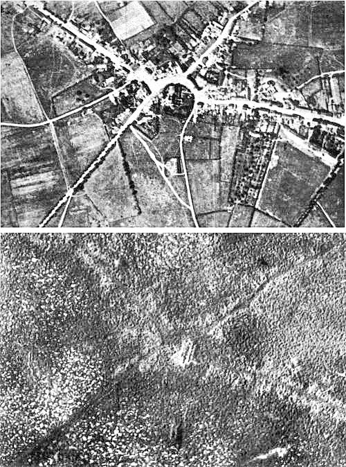


19:08, 2 July 2009 (UTC)


). Would seem to be a matter of time before someone wakes up and does the same in the other articles as well. --jjron (talk) 15:29, 8 March 2009 (UTC)
